
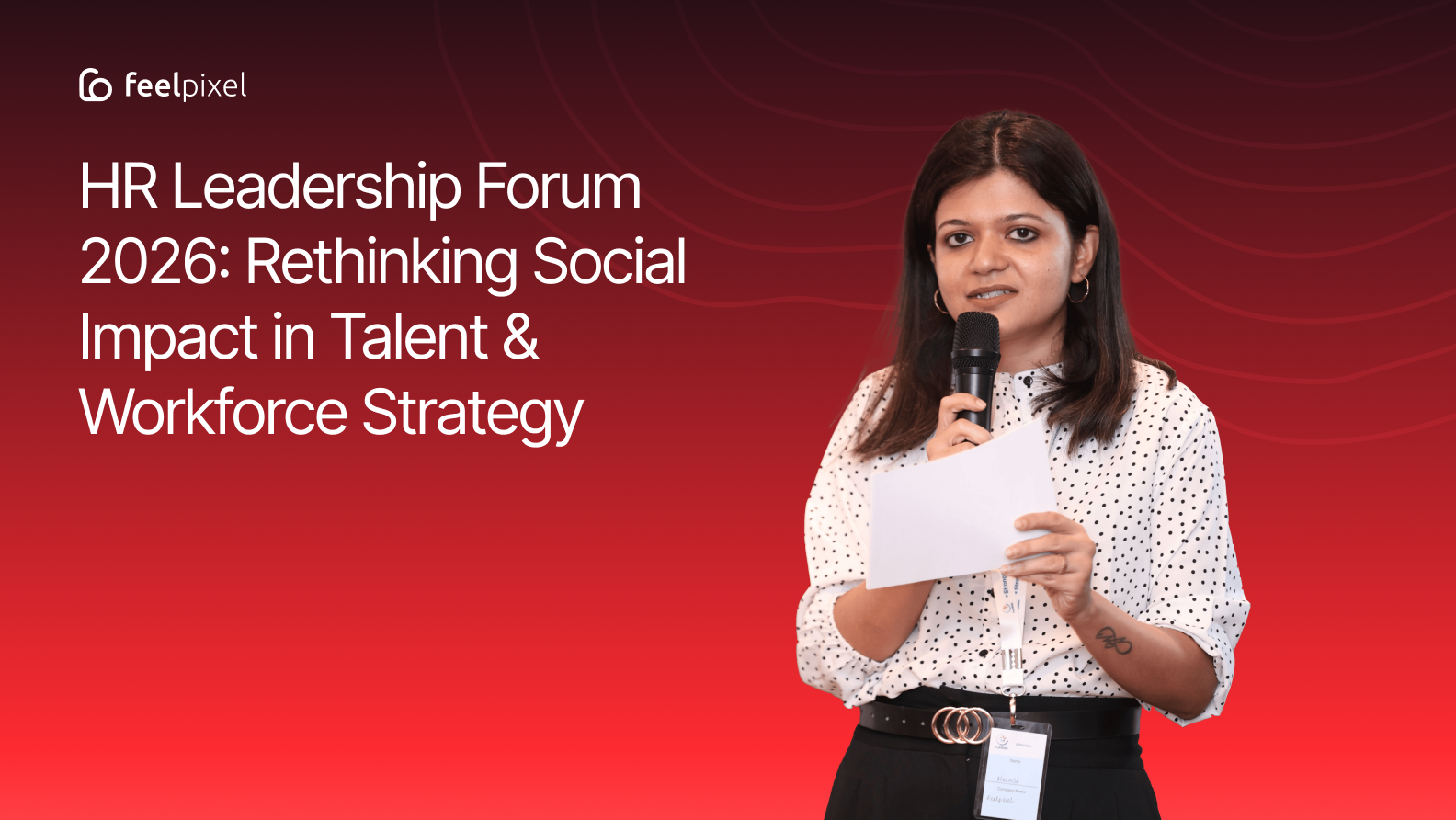
The myHRSG HR Leadership Forum 2026 – Pune Chapter brought together some of the most forward-thinking HR leaders, talent strategists, and people enablers to discuss various powerful and timely themes
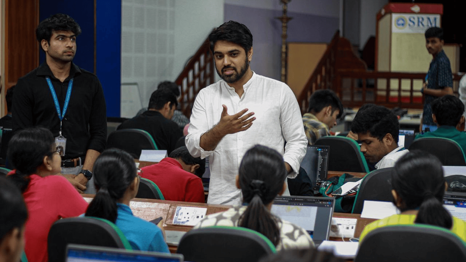
In 2023, Nitin Panwar led an engaging full-day UI/UX Designathon at SRM Institute of Science and Technology, organized by Aaruush in collaboration with Feelpixel.
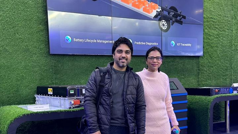
In 2023, Feelpixel had the opportunity to witness and participate in one of the most significant automotive events in Asia—Auto Expo 2023. Jointly organized by Automotive Component Manufacturers Association of India, Confederation of Indian Industry, and Society of Indian Automobile Manufacturers.