


In the discovery phase, we gained a deep understanding of the user requirements, business goals, competitors’ strengths and weaknesses, industry trends, and the current state of the product.

In the define phase, we analysed the information we’ve obtained to draw insights and defined the goals, objectives, and our strategy moving forward into the process.

In this phase, we generated and explored a wide range of concepts through wireframes and lo-fi prototypes. We then developed a design language and applied the same throughout the designs.
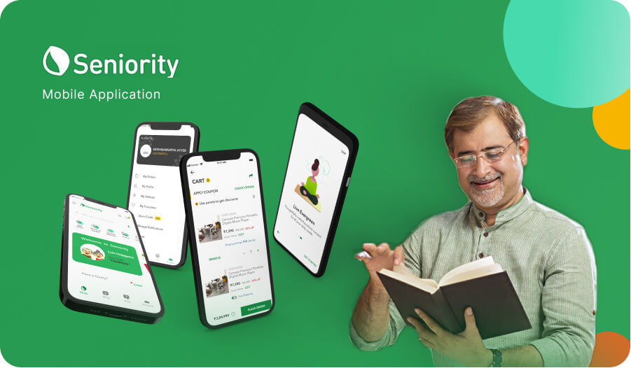 E-commerceSeniority
 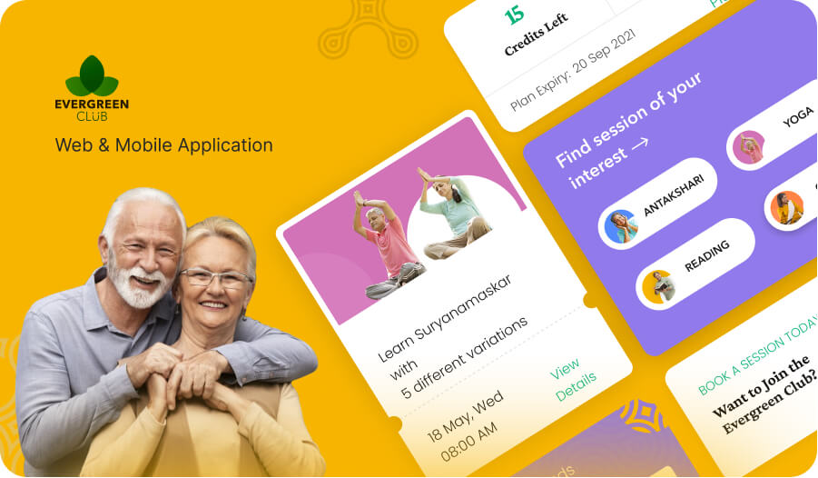 EntertainmentEvergreen
 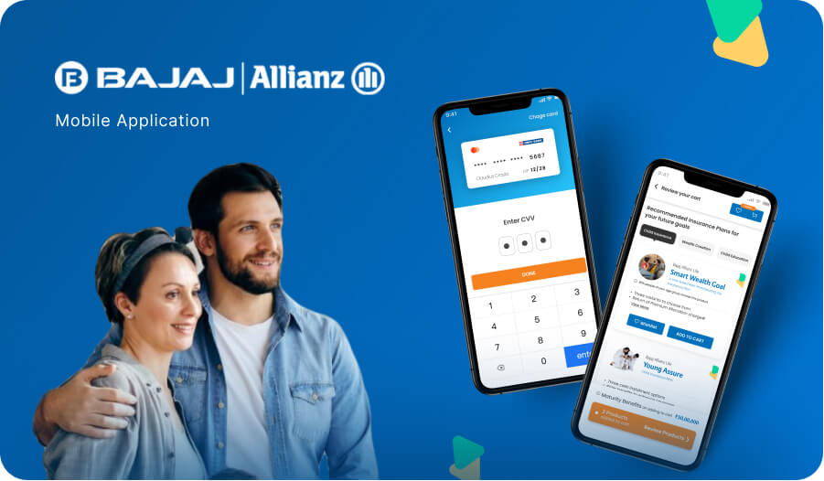 FintechBajaj Allianz