Introduction
What is fintech UX design?
Fintech UX design is the practice of designing financial product interfaces, such as banking apps, lending platforms, investment tools, and insurance portals, so that regulatory compliance, security, and user trust work together instead of against each other.
Why does it matter?
- SIP contributing accounts crossed 9 crore in mid-2025, per AMFI Monthly Note (July 2025)
- Digital lending is reshaping retail credit across NBFCs and new age lenders
- Neo banks, insurance aggregators, and embedded finance platforms are all competing for the same user attention
The fintech products winning in this environment share one thing, they treat trust as a design decision, not a legal department deliverable.
What Are The Real Challenges in Fintech UX ?
1. KYC Drop Off Is a Design Problem
- Industry data consistently shows drop off rates of 40 to 60% for manual or poorly designed digital KYC flows (Source: One Constellation, KYC Onboarding Automation, April 2026)
- Users abandon most at document upload, facial recognition, and unsolicited permission prompts
- The issue is not user reluctance. It is design failing to communicate why each step matters and what comes next
2. Too Many Security Signals Backfire
3. Financial Decisions Trigger Cognitive Overload
4. Compliance Constraints Are Misused
UX Frameworks Feelpixel Applies for Fintech Product Design
Don Norman’s Emotional Design Model
- Visceral: first impression, visual trust, no clutter that signals complexity before the user has done anything
- Behavioural: flows where users feel competent completing a financial task on their own
- Reflective: the feeling after. Did the user feel informed? In control? That is where long term retention is built
Jobs to Be Done (JTBD)
- Functional job: invest money, get a loan
- Emotional job: feel financially responsible
- Social job: be someone who has their finances in order
These distinctions shape content hierarchy, onboarding tone, and feature prioritisation in ways that user flow diagrams alone never surface.
Check out how Feelpixel works in Fintech & BFSI
How Feelpixel helped Fintech Brands
At Feelpixel, we believe compliance defines what must be shown, but UX defines how users experience it. Our process combined regulatory alignment, user research, cognitive load mapping, and progressive disclosure to simplify complex financial journeys.
Kotak Cherry (Kotak Investment Advisors)
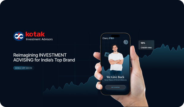
Redesigned the HNI onboarding and risk profiling journey for Kotak Cherry’s investment app. Transformed a compliance heavy form into a guided discovery conversation with illustrated scenario questions and a Cherry Pro guide persona.
What users said in research: “I felt like I was filling out a form, not talking to someone who wanted to help me.”
- Replaced static form fields with illustrated scenario questions in plain language
- Added a Cherry Pro guide persona to create a sense of expert accompaniment
- Changed the progress indicator from a completion percentage to a growing picture of the user’s investment personality, so every answer gave something back
Outcome: Higher first session investment confidence scores. Fewer support queries in the first 30 days post launch.
Client Testimonial
Ex AVP Design, Kotak Cherry
Case Study
https://www.feelpixel.in/kotak-cherry/
LOANS24 (CARS24 Financial Services)
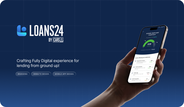
- Built a progressive input model where the first three screens generate a preliminary loan offer.
- Users saw an estimated amount and tenure before being asked for any documentation.
- Added micro interactions at the credit check stage to frame it as personalisation, not judgment.
- A/B tested gamified progress elements against a standard loading screen during prototype validation.
Client Testimonial
“Feelpixel played a key role in shaping LOANS24’s trusted digital lending platform, crafting a strong brand identity, intuitive website, and seamless app experience. Their deep understanding of design, user behavior, and fintech complexity helped simplify intricate loan processes into effortless digital journeys. With agility, creativity, and a problem-solving mindset, they delivered high-quality results, exceeding expectations as a valuable design partner.”
Group Product Manager, Cars24
Impact at a Glance
| Project | Outcome |
|---|---|
| LOANS24 | Shorter time to offer acceptance through progressive input redesign (Q3 2023 prototype validation) |
| Kotak Cherry | Higher Day 1 investment confidence scores, fewer support queries in first 30 days post launch |
| Lendingkart | 7 stage flow reduced to 4 stages, lower time on verification screens |
Key Takeaways
- Trust is the actual product in fintech. Compliance tells you what must appear in an experience, not how users should feel encountering it.
- Up to 60% of users abandon digital KYC flows, mostly at document upload, facial recognition, and unearned permission prompts.
- Stacking security disclosures early backfires. Progressive disclosure builds trust faster than front loading every warning at once.
- Financial decisions are cognitively heavier than shopping or browsing. Design for lower overload thresholds, not generic interaction patterns.
- Real outcomes back the approach: redesigned onboarding for Kotak Cherry and a reframed loan journey for Loans 24 both improved completion and confidence metrics.
- The reflective layer, how users feel after a transaction, is where fintech retention is actually won or lost.
- Author’s view: Teams optimize for compliance sign off, not for the moment a user feels safe enough to proceed. Those are not the same thing, and confusing them is where most fintech onboarding quietly fails.
Frequently Asked Questions
What makes fintech UX different from general product design?
Three constraints hit simultaneously: regulatory mandates on what must appear and when, user psychology shaped by financial anxiety, and product complexity spanning KYC flows, calculators, and data dense dashboards. Domain depth is not optional.
How does Feelpixel handle compliance without wrecking UX?
Does UX design actually move fintech conversion rates?
What does a Feelpixel fintech engagement look like?
Stage 2: User research segmented by financial literacy and digital comfort
Stage 3: Design sprints with regular client reviews
Stage 4: Scenario based usability testing and design system delivery
Do you handle Figma handoff and design system implementation?
What fintech products has Feelpixel designed?
HNI wealth management and investment: Kotak Cherry Case Study
SME business lending: Lending Kart Case Study
Insurance commission management: CommissionR Case study (Tata AIG)
Property auction portal: Auction Bazaar