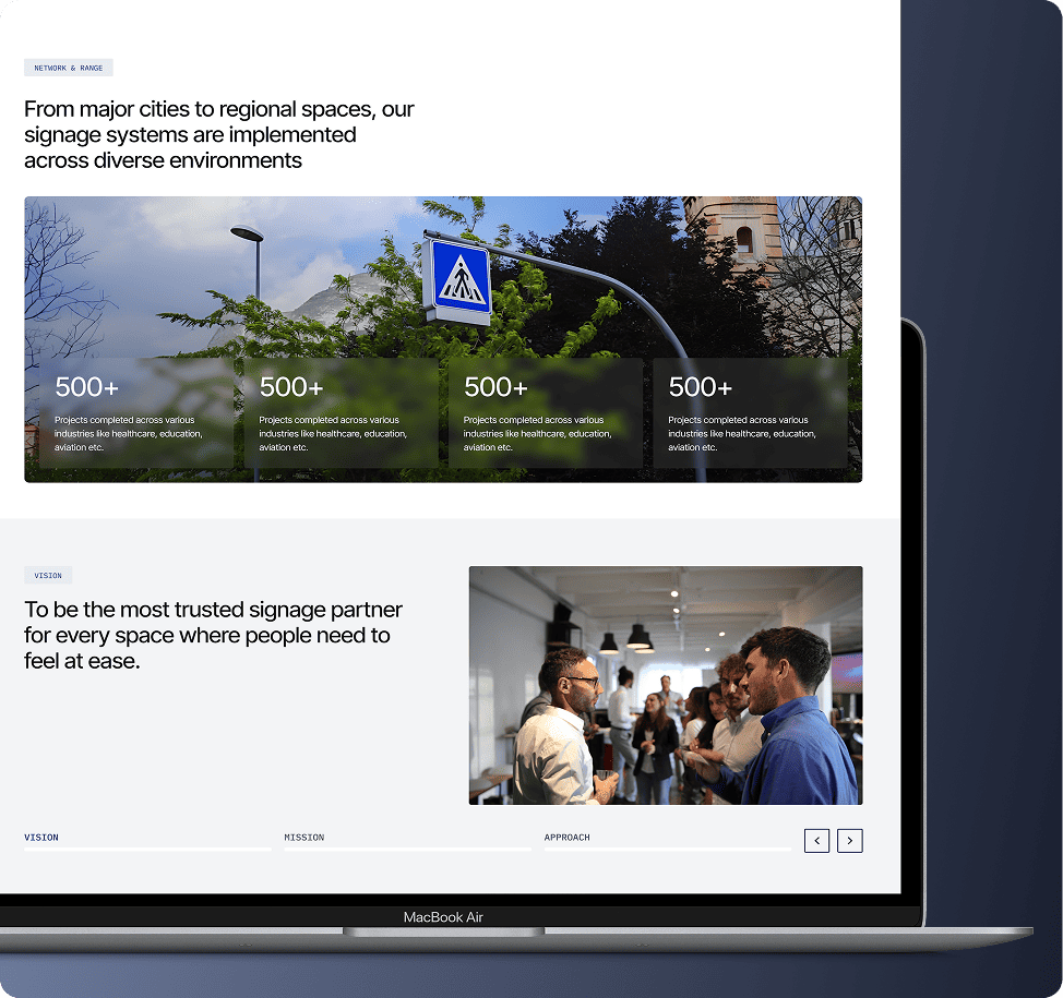
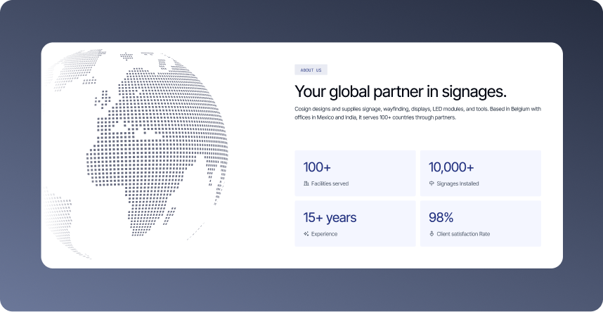
Cosign is a Belgium-based global signage manufacturer serving 100+ countries across sectors like healthcare, aviation, retail, and education. Repositioned Cosign as a globally credible signage systems brand while making the platform work equally well for two very different markets i.e Belgium and India.
Website Design
M-site
Web application
Product Catalogue
What Challenges Were Limiting Product Discovery on Cosign?
01
Serving Multiple Buyer Types .
Designing one experience that felt relevant to architects, sign makers, and project owners. Three very different people with very different needs, without it feeling generic, was the core tension to solve.
02
Making a Complex Product Range Feel Navigable
Making it easy to browse a wide catalogue across eight industries and multiple product systems without stripping away the technical depth that serious buyers actually need.
03
Balancing Global Credibility with Local Relevance
The website needed to work for both Belgium and India. Two markets with very different buying behaviours and expectations.
How Did Feelpixel Improve Navigation and Product Discovery for Cosign?
The objective of this project was to design a website for Cosign that could handle the complexity of a global B2B signage brand without making it feel complex to use. With a wide product catalogue, multiple buyer types, and a presence across 100+ countries, the site needed to clearly communicate what Cosign offers, who it’s for, and why it can be trusted, all while making it as easy as possible for the right visitor to take the next step and get in touch.
Category-led browsing experience
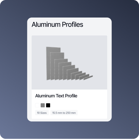
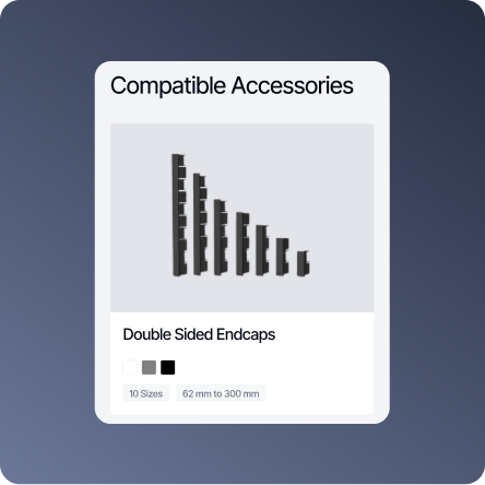
Cosign Modular Sign Systems operates across multiple countries with a wide range of signage systems, making product organisation and navigation a major UX challenge. Different users searched differently, some by application type like indoor or outdoor signage, while others looked for technical system categories. To solve this, we designed a scalable two-level navigation system. Products were first organised by usage categories such as Indoor, Outdoor, Display, Digital, Exit, and Eco Friendly signages, followed by technical classifications for deeper exploration. We also introduced interaction patterns like hover previews and scroll-based browsing to reduce discovery friction and make product exploration faster and more intuitive. Clean card layouts and product-photography-led visuals further helped users scan and compare products easily.
Designing for Multiple Buyer Types
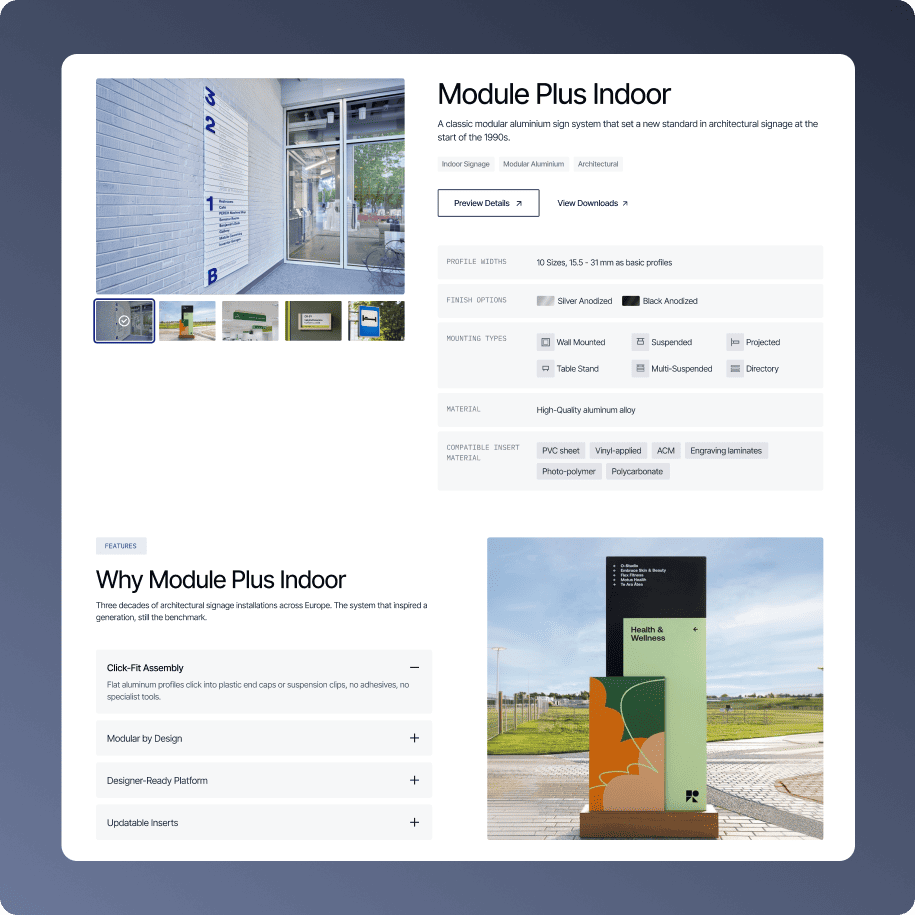
The product page begins with large product imagery and concise introductory information to help users quickly understand the product, its application, and overall design language before moving into specifications. Technical details are organised into modular information blocks. As users scroll further, the page gradually introduces product features, real-world use cases, specifications, installation videos, and downloadable catalogues in PDF formats for different configurations and requirements. The layered experience helps architects explore aesthetics, sign makers access technical details, and project owners evaluate usability within one streamlined flow.
Elevating Cosign Through Interaction & Visual Clarity
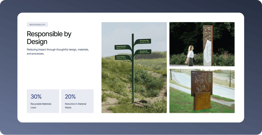
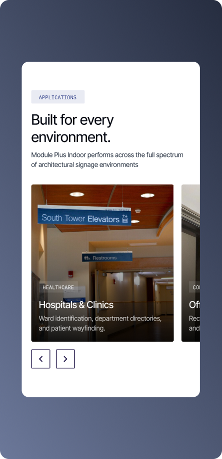
Cosign’s previous website felt visually generic and lacked the clarity and interaction depth expected from a premium global manufacturer. The redesign focused on creating a more product-first experience through a clean, image-led interface that allowed the work to speak for itself. Intuitive micro-interactions, including expandable content sections, smooth horizontal scrolling galleries, and subtle hover transitions, were introduced to make browsing feel more engaging without adding complexity. Large-scale imagery, restrained typography, and structured navigation helped surface products and case studies more naturally. The result was a more immersive and modern experience that reflected the precision and quality of the brand itself.
Insights
Lowering the Barrier Without Diluting Depth
Security testing was designed to feel approachable without oversimplifying the problem. By enabling natural language inputs and guiding users through visible system actions, the experience supports both first-time users and security experts within the same flow.
Clarity Over Volume in Security Insights
Findings were structured to prioritize understanding and action. Grouping evidence and fix guidance together helped teams move from detection to resolution without navigating scattered.
Visibility Builds Trust in AI Systems
Users are more confident when they can see what the system is doing. Making AI agent activity, execution steps, and real-world validation visible reduced uncertainty and helped users understand how conclusions were reached.
Hear it from our client
Working with Feelpixel was a great experience. As Cosign continues to grow across multiple offerings, we needed a website experience that could scale with the business and clearly communicate our value. The Feelpixel team took time to deeply understand our products, audience, and challenges and rethought our navigation, product categorization, and user journeys to create a much more intuitive experience. The website now delivers quicker context, simplifies product exploration, and makes it easier for different user groups to connect with us.
Shane VerbistMarketing & Sales, Cosign
Frequently Asked Questions
1. What was the main UX challenge with Cosign's global signage website?
Cosign’s product range spans eight-plus signage categories and multiple systems, used by architects, sign makers, and project owners across 100+ countries, including very different markets like Belgium and India. Users struggled to find relevant products quickly because navigation didn’t account for how differently each buyer type searched.
2. How did Feelpixel simplify navigation across Cosign's large product catalogue?
Feelpixel introduced a scalable two-level navigation system, organizing products first by usage context (Indoor, Outdoor, Display, Digital, Exit, and Eco-Friendly signage), then by deeper technical classification. This let users browse by application or by system type, whichever matched their intent.
3. How does the redesigned Cosign website serve multiple buyer types on a single product page?
Product pages layer information progressively: large imagery and concise intros up top for quick understanding, followed by technical blocks, real-world use cases, specifications, installation videos, and downloadable catalogues. This lets architects assess aesthetics, sign makers evaluate technical detail, and project owners check usability, all within one page.
4. What interaction patterns did Feelpixel use to improve product discoverability?
The redesign introduced hover previews, scroll-based browsing, expandable content sections, and real-world imagery galleries. These reduced discovery friction and made exploring Cosign’s product range feel faster and more intuitive without adding visual complexity.
5.How did Feelpixel balance global credibility with local relevance for Cosign?
Feelpixel rethought Cosign’s product categorization, identity, and user journeys so the same platform could work equally well for both Belgium and India, communicating global scale while remaining accessible to region-specific buying behaviors and expectations.
6. What was the visual design direction for Cosign's website redesign?
The redesign moved away from a visually generic catalog feel toward a product-first, image-led interface. It used large-scale real installation imagery, restrained typography, and structured navigation to reflect the precision and quality expected of a premium global signage manufacturer.
Similar Projects
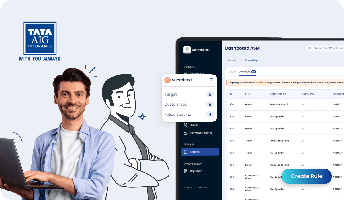
Designed for TATA AIG, CommissionR helps sales managers structure commission payouts for producers across different insurance segments of businesses.
Designed an insightful dashboard for RiskProfiler that enhances security with advanced cybersecurity solutions, providing real-time ratings and automated risk analysis.
We redesigned the product to simplify complex workflows, establish a consistent interface, and empower DevOps and security teams to fully utilize its protection capabilities.
We strategically redesigned experiences which empowers cybersecurity professionals to effortlessly manage security events, devices, and threats, while ensuring a modern, intuitive user experience.




 FintechTATA AIG
 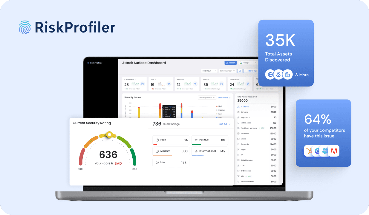 Cyber SecurityRisk Profiler
 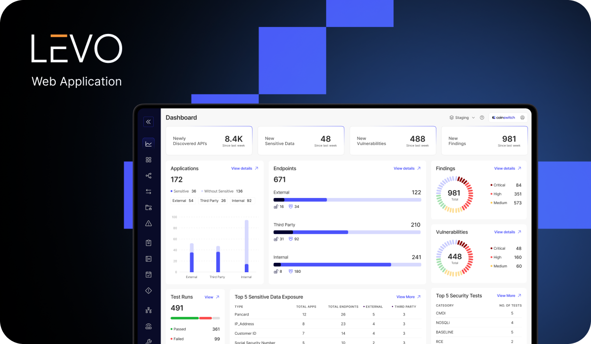 Cyber SecurityLevo
 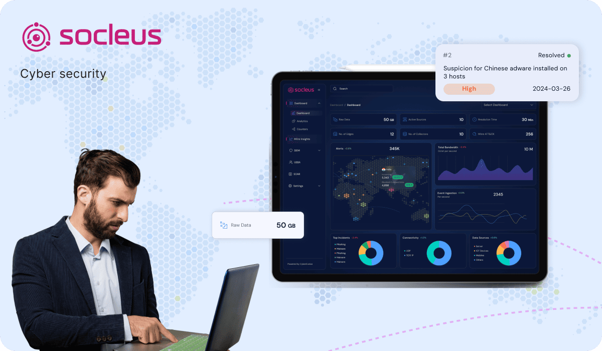 Cyber SecuritySocleus