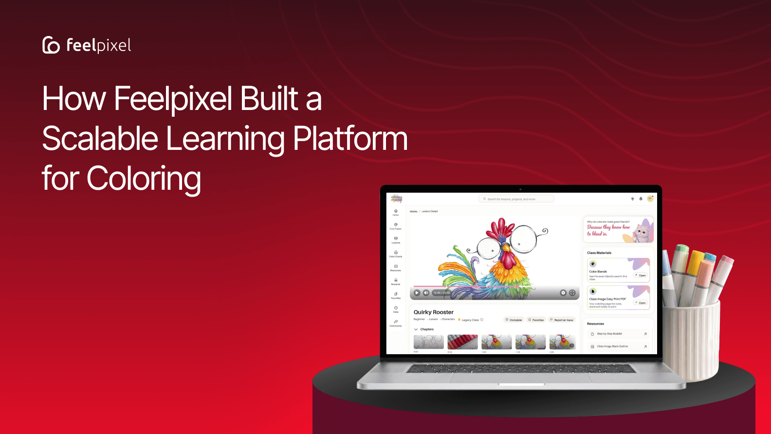
Transforming a manually managed coloring education experience into a connected digital platform designed to support creative learning, helping learners discover, learn, progress, and keep creating.
Quick answer
Feelpixel helped The Coloring Channel transform a manually managed content-delivery process into a connected digital learning platform. The project focused on making it easier for learners to discover lessons, know where to begin, continue their progress, and manage their memberships. By bringing content, member access, subscriptions, and learning journeys into one experience, the platform also reduced operational time by around 90%.
Creative learning isn’t linear. Unlike traditional learning platforms that often guide users through a predefined path, creative learners may explore, pause, return, and follow different interests. This can make discovery, continuation, and engagement harder. This article explores how UX design can create the right balance of structure and freedom, using The Coloring Channel as an example.
Why Does Creative Learning Need a Different UX Approach?
Creative learning doesn’t always follow a predefined path. A learner might arrive with a specific skill they want to develop, browse for inspiration, work on a project, or return to something they started earlier. For a creative learning platform, these different behaviours create unique UX challenges around discovery, organisation, navigation, and continuity.
As content libraries grow, these different behaviours create more decisions for learners. Finding the right lesson becomes not just a content problem, but a question of discovery, organisation, navigation, and continuity.
A useful creative learning experience therefore needs to provide structure without forcing every learner through the same path. It should help people understand where they can begin, find relevant content, and continue learning while still giving them the freedom to explore.
This section would cover your five points without sounding like a generic “Why this matters” SEO section.
When Great Content Becomes Difficult to Manage
Before the platform was built, tutorial videos were shared with members individually through email after their access was confirmed. Membership and payment information also required manual coordination. As the audience grew, keeping track of members, managing access, and delivering the right content to the right person became increasingly time-consuming.
The opportunity was therefore bigger than moving videos from email to a website.
It was about creating a digital experience that could make learning easier to access and navigate, while still capturing the approachable and encouraging spirit of The Coloring Channel.
How could a digital platform make it easier for learners to discover what to learn, know where to begin, continue their progress, and return to learning?
The journey became less about creating a place to host colouring videos and more about designing an experience that could support learners before, during, and after a lesson.
Understanding the Learner Challenges
During our initial stakeholder discussions, the team at The Coloring Channel highlighted challenges that went beyond content delivery and platform management.
Their audience included many learners who were not highly comfortable with technology. For them, navigating a digital learning platform, finding the right lesson, or understanding what to do next could become a barrier to learning.
The team also observed that some learners dropped off before completing lessons. This raised an important experience question: how could the platform make learning feel simple enough to start, clear enough to navigate, and engaging enough to continue?
These conversations helped shape the direction of the product. Rather than designing only for access to a large content library, we needed to consider the entire learner journey:
- Make it easy to get started: reduce the uncertainty that comes with unfamiliar digital experiences.
- Make discovery intuitive: help learners find relevant content without needing to understand the entire library.
- Create continuity: make it easy to return to an unfinished lesson and pick up where they left off.
- Encourage completion: introduce progress and engagement cues that support learners without making the experience feel distracting or overly gamified.
These weren’t simply interface problems. They influenced how we approached the platform’s information architecture, navigation, learning flows, and engagement model.
From Delivering Content to Designing an Experience
The first shift was conceptual. The existing model was centred around delivering content. A member had access to a lesson, and that lesson could be shared with them.
But behind that simple interaction was a considerable amount of manual coordination. Access had to be confirmed, membership information managed, and content shared individually. As the audience grew, the experience became increasingly dependent on the team keeping these moving parts aligned.
A digital learning platform gave us the opportunity to rethink that relationship.
Instead of treating membership, content access, learning, and progress as separate activities, we could bring them together into one connected experience. That changed the question from:
How do we give members access to lessons? → What does a learner need around the content, not just inside it?
A learner needs ways to discover what interests them, understand where to begin, pick up where they left off, and find something useful when they’re ready to continue.
At the same time, the team behind the experience needs a system that reduces repetitive manual coordination.
The goal was not simply to make content available. It was to make the experience around that content useful for both the learner and the people managing it.
Where Does a Colourist Journey Begin?
Creative learners don’t necessarily arrive with the same goals. A new colourist may want to understand the basics before attempting a complete project. Someone with more experience may already know which technique they want to improve. Another learner may simply be looking for inspiration.
There isn’t always one correct starting point. That made discovery an important part of the experience. Rather than assuming every learner should follow the same path, we thought about how the platform could provide clear entry points without prescribing the entire journey.
A learner who knows exactly what they want should be able to find it. Someone who isn’t sure should still have enough guidance to get started.
The goal wasn’t to tell every learner where to go. It was to make the first step easier to take.
Ramchandra Rao
Auction Bazaar
How Do You Make a Large Learning Library Feel Smaller?
More content is valuable, but more content also means more decisions. As The Coloring Channel’s library grows, learners shouldn’t have to understand the entire catalogue before they can find something useful.
The challenge wasn’t simply organising hundreds of lessons.It was making the relationships between those lessons understandable.
When content is organised around the way learners look for it, discovery becomes easier and the library starts to feel less overwhelming.
What Comes Next in the Learning Journey?
Finding a lesson is only one part of the journey. Creative learning often happens across multiple sessions. A learner might start a project, stop to practise, return later, explore another technique, and then come back to the original lesson.
The experience shouldn’t treat each return as a completely new beginning. It should provide continuity.
When learners come back, the product can help answer simple questions:
- Where was I?
- What was I working on?
- What could I do next?
This thinking influenced how we approached continued learning within The Coloring Channel. Instead of making learners search through the library for something they had already started, the experience could bring relevant learning back into view. It’s a small shift, but an important one.
The product shouldn’t make learners remember their journey. It should remember enough of it to help them continue.
How Can Engagement Feel Natural?
Engagement is often treated as a problem that needs more features.
- More badges.
- More notifications.
- More rewards.
- More reminders.
But creative learning has a different objective. The goal isn’t simply to keep someone inside the platform. It’s to give them reasons to continue learning and creating.
For The Coloring Channel, we explored small moments that could make progress more visible and the experience more encouraging.
These elements were designed to reinforce the satisfaction that already comes from learning something new, making progress, and seeing that progress over time.
Engagement works best when it supports the reason people came to the platform in the first place: to learn, practise, and create.
How Do You Give Learners More Control?
A learner’s needs can change over time. Someone may begin by focusing on one medium and later want to explore another. Their interests may change, or the amount of time they can dedicate to learning may vary.
That makes membership more than a simple “subscribe or cancel” decision. The experience needs to give members enough flexibility to manage their relationship with the platform as their needs change.
For The Coloring Channel, membership became part of the broader product experience rather than something that existed separately from learning.
Clear information and flexible controls can make those decisions easier while giving members more confidence in managing their plans. The broader principle is simple:
When people’s needs change, the product should make it easy to change with them.
How Did We Bring The Coloring Channel’s Brand Into the Experience?
There was another challenge running through every part of the experience. The platform needed structure. But it shouldn’t feel rigid.
It needed to support content, navigation, membership, progress, and other functionality while still feeling approachable, creative, and recognisably The Coloring Channel.
That created a balance between:
- Structure and exploration
- Guidance and freedom
- Functionality and personality
The visual language became part of solving that balance. Colouring imagery, illustrations, characters, rewards, typography, cards, and interface components came together to create a product that felt connected to the creative nature of the brand while maintaining the clarity expected from a learning platform.
The objective wasn’t to make the interface playful simply for the sake of being playful.
It was to make the product welcoming enough to explore and structured enough to learn from.
From a Collection of Lessons to a Learning Journey
Looking at the experience as a whole, the most important shift wasn’t a single feature. It was the relationship between the different parts of the product.
A learner can discover something, choose where to begin, start learning, pause, return later, continue, explore another technique, recognise their progress, and eventually find another reason to come back. Each part of the experience supports the next, creating a more continuous relationship with the content.
The lesson is no longer the end point. It becomes a starting point for what comes next.
What Did Designing The Coloring Channel Teach Us?
The project reinforced something we believe is especially important in creative learning:
Structure and freedom aren’t opposites.
The role of UX is to connect those two things:
- A clear starting point: reduces uncertainty
- Thoughtful content organisation: makes exploration easier
- Continuity: makes returning feel effortless
- Progress: provides momentum
- Personality: makes the experience more inviting
For The Coloring Channel, the opportunity wasn’t simply to replace a manual way of sharing lessons.
It was to create a connected experience that could grow with its learners while making the experience more manageable behind the scenes.
The best creative learning experiences don’t tell learners exactly where to go. They give them enough structure to move forward and enough freedom to decide where they want to go next.
Client Perspective
“The Coloring Channel started as fairly broad strokes and a very big idea, and we’re grateful to the Feelpixel team for their help in translating that into a direction the team could build from. It’s wonderful to now see that initial vision come together as a real experience for our customers. We also really appreciated the work and support throughout the development process, and particularly the assistance around launch that helped us get the platform over the line. This has been a very significant project for our business, and we appreciate the amount of work that has gone into getting it to this point. We could not have done this project without the wider Feelpixel team.”
Key Strategic Takeaways
- Give learners structure without forcing a single learning path.
- Organise content around how learners actually search and explore.
- Design for continuity so learners can easily return to unfinished learning.
- Use engagement features to support learning rather than distract from it.
- Balance usability with brand personality to make the experience both clear and memorable.
Frequently Asked Questions
What was the Coloring Channel UX design project about?
The project focused on transforming The Coloring Channel’s manually managed content-delivery experience into a connected digital learning platform. The experience was designed to make it easier for learners to discover content, begin learning, continue their progress, and manage their membership.
What was the main UX challenge with The Coloring Channel?
How did Feelpixel approach the UI/UX design of The Coloring Channel?
What did Feelpixel discover during research for The Coloring Channel?
How did Feelpixel incorporate the business perspective into the design of The Coloring Channel?
How did Feelpixel balance guidance and freedom in the learning experience?
The experience combines structured entry points with the freedom to explore. Members receive guidance through onboarding, first projects, recommendations, and organised lesson categories, while browsing and search give them the flexibility to choose what they want to learn and explore based on their interests.
How did Feelpixel keep members motivated throughout their learning journey?
Author’s Note
A learning platform should do more than give people access to content. It should help them understand where to begin, what to explore next, and how to continue their journey.
For us, that’s what thoughtful learning UX should do: turn a collection of content into a journey that feels clear enough to navigate, engaging enough to return to, and flexible enough to make your own.
Work with Feelpixel
Whether you’re building a new learning platform or evolving an existing one, we can help shape the experience from strategy and structure through UX/UI design and development. Our work spans education and digital products, with services including product discovery, UX research, information architecture, usability testing, content strategy, design, and development.
Ready to create a better digital experience for your real estate business?