User Research & Discovery Agency for Insight-Led Decisions
We help organizations validate ideas, understand customer needs and identify growth opportunities through user research, UX audits, competitor analysis and product discovery.
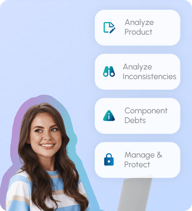
We assess your existing product, identify inconsistencies, evaluate design maturity, and establish scalable foundations that support product growth and long-term maintainability.
UI Inventory & Component Audit
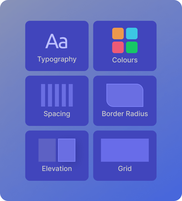
Design Foundations
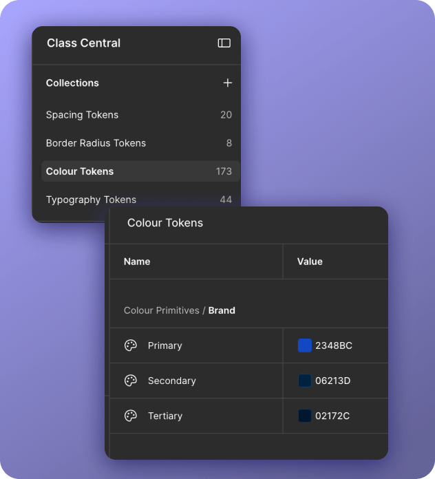
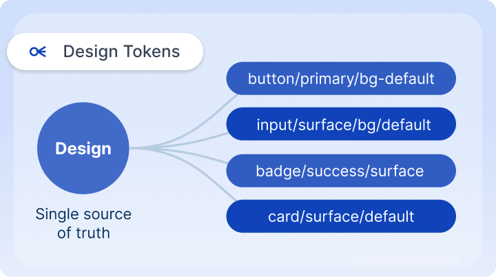
Design Tokens
Typography, Color & Icon Systems
Spacing, Grid & Layout Foundations
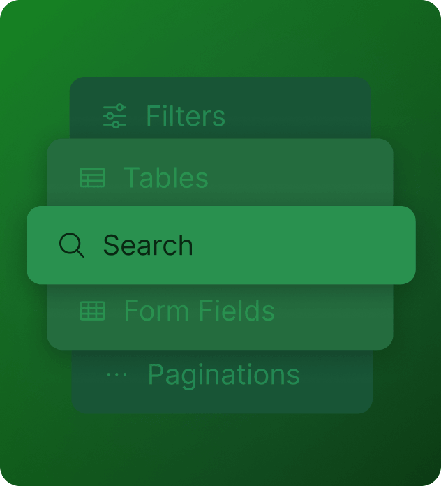
Scalable Component Libraries
We build reusable component libraries that evolve into scalable design systems, helping teams design faster, collaborate better, and maintain consistency across products and platforms.
Component Library
Pattern Library
Design Variables
Templates & Page Layouts
Multi Platform Systems
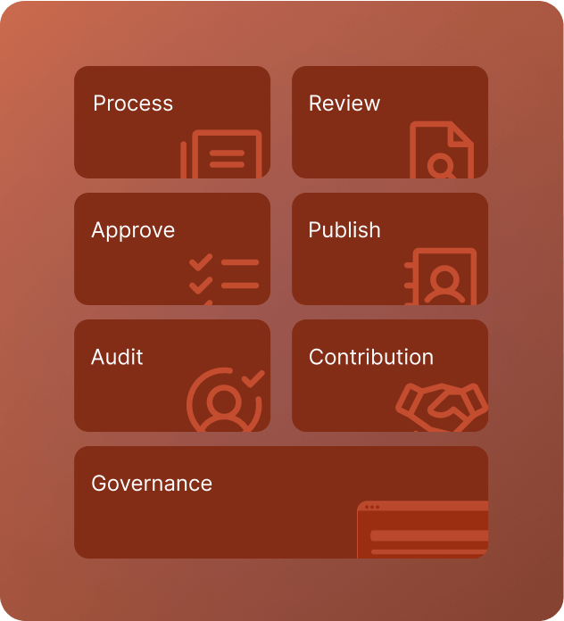
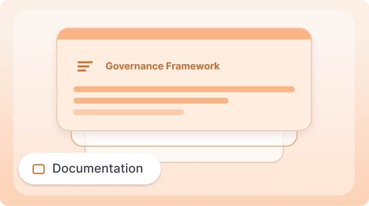
Governance & Documentation
We define the processes, documentation, and ownership needed to help teams adopt, manage, and continuously evolve their design systems with confidence.
Documentation & Guidelines
Governance Framework
Team Enablement & Handover
Review & Publishing Process
Audit & Maintenance
Bundle Service
Your End-to-End Design System Partner
Whether you're starting with a component library, scaling an existing design system, or establishing governance for long-term adoption, we help teams build consistent, scalable systems that accelerate product development and business growth.
We assess your existing product, UI patterns, workflows, technology, and team needs through interface audits, stakeholder discussions, and component analysis to identify inconsistencies and opportunities for standardisation.
Foundations & Principles
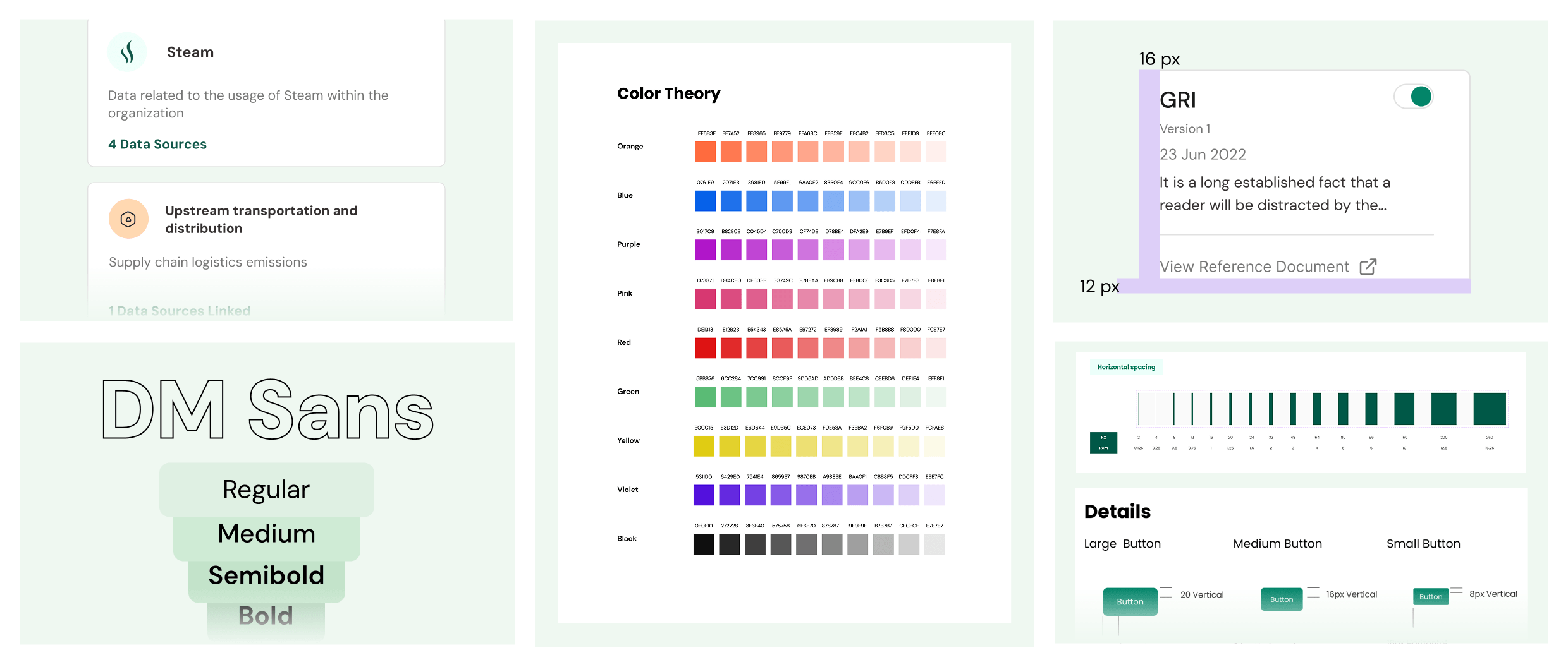
We establish the core foundations including color, typography, spacing, grids, iconography, accessibility, and design tokens, creating a shared visual language that can scale consistently across the product.
Components & Patterns
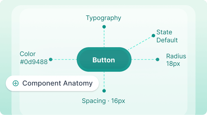
We design reusable components, variants, states, and interaction patterns based on real product use cases, ensuring the system supports flexibility without compromising consistency or usability.
Systemisation & Implementation
We structure libraries, variables, naming conventions, and component architecture while collaborating closely with developers to ensure smooth implementation and alignment between design and code.
Documentation & Governance
We document usage guidelines, accessibility standards, component behaviour, and contribution processes, creating a governance model that helps teams maintain, evolve, and scale the system over time.
Ready to build a design system that scales with your product?
“Design systems aren't built to create consistency alone. They create the confidence for teams to move faster without compromising quality or the experience they deliver.”
Nitin Panwar
Founder & Design Director
OUR RESEARCH PRACTICE
Design Systems solutions we've shipped
Cars 24
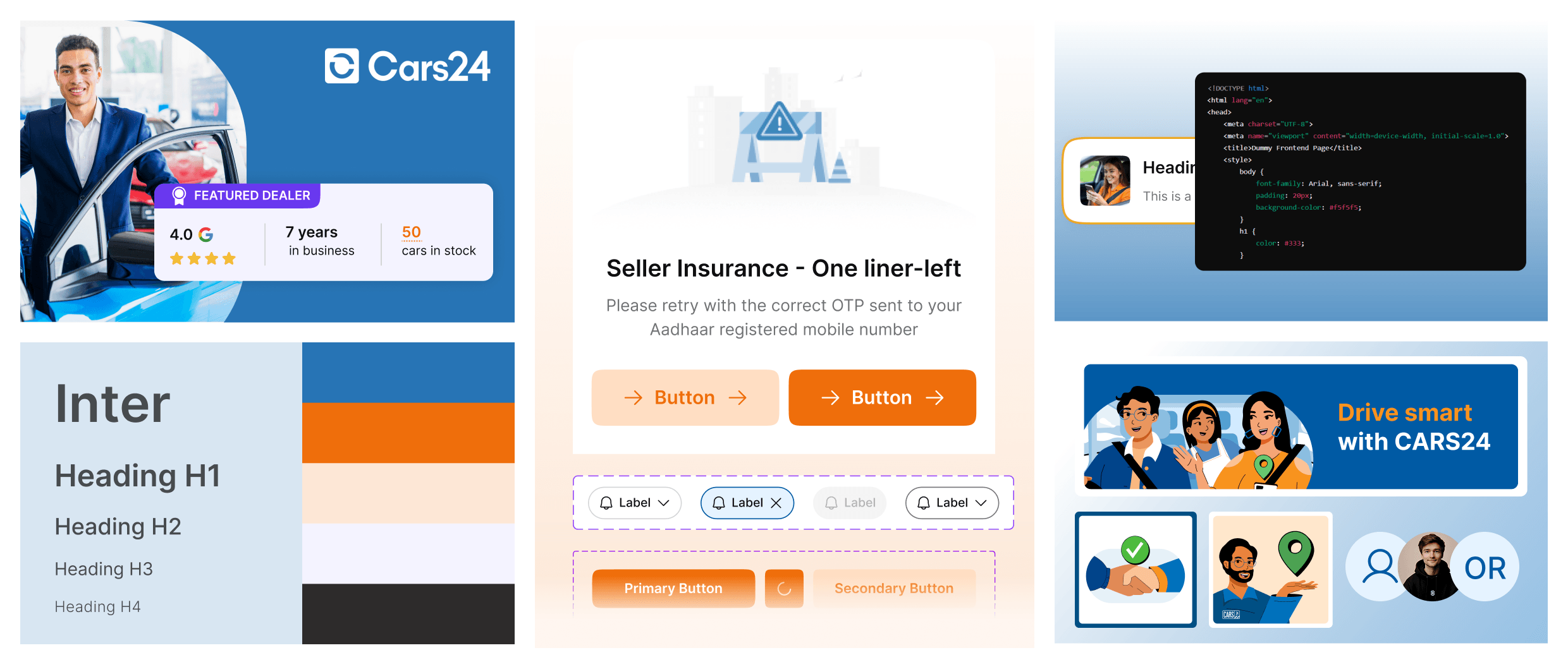
For Cars24, we built a scalable design system used across 8 different products, with reusable components, interaction states, typography, colours, and illustration styles. Designed for accessibility, inclusion, and multi platform use, the system improved consistency, reduced repetitive effort, and enabled faster product delivery.
Asus
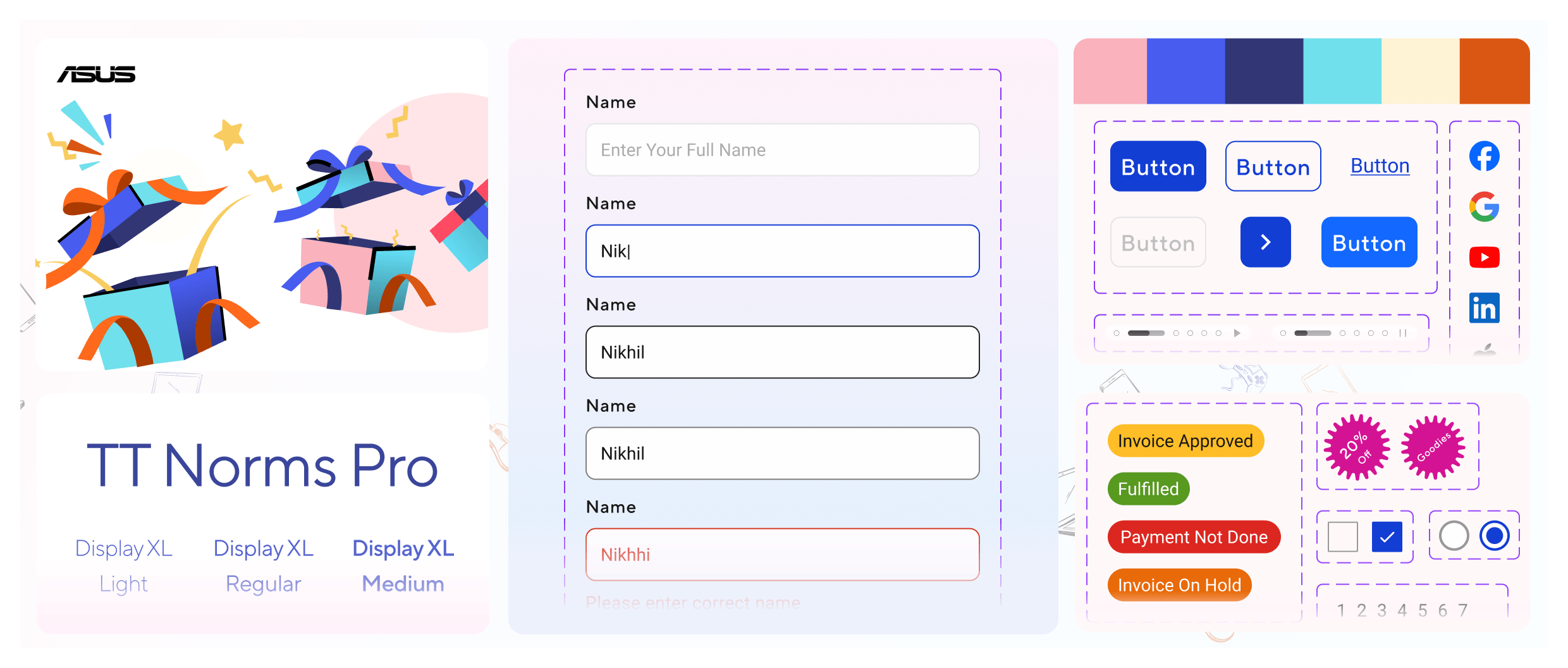
Our work extended beyond UI components to build a scalable illustration system for ASUS. By creating a central library of reusable illustrations and visual assets, we enabled consistent storytelling across websites, campaigns, offers, and digital touchpoints while making future creative production faster and more efficient.
SOCLEUS
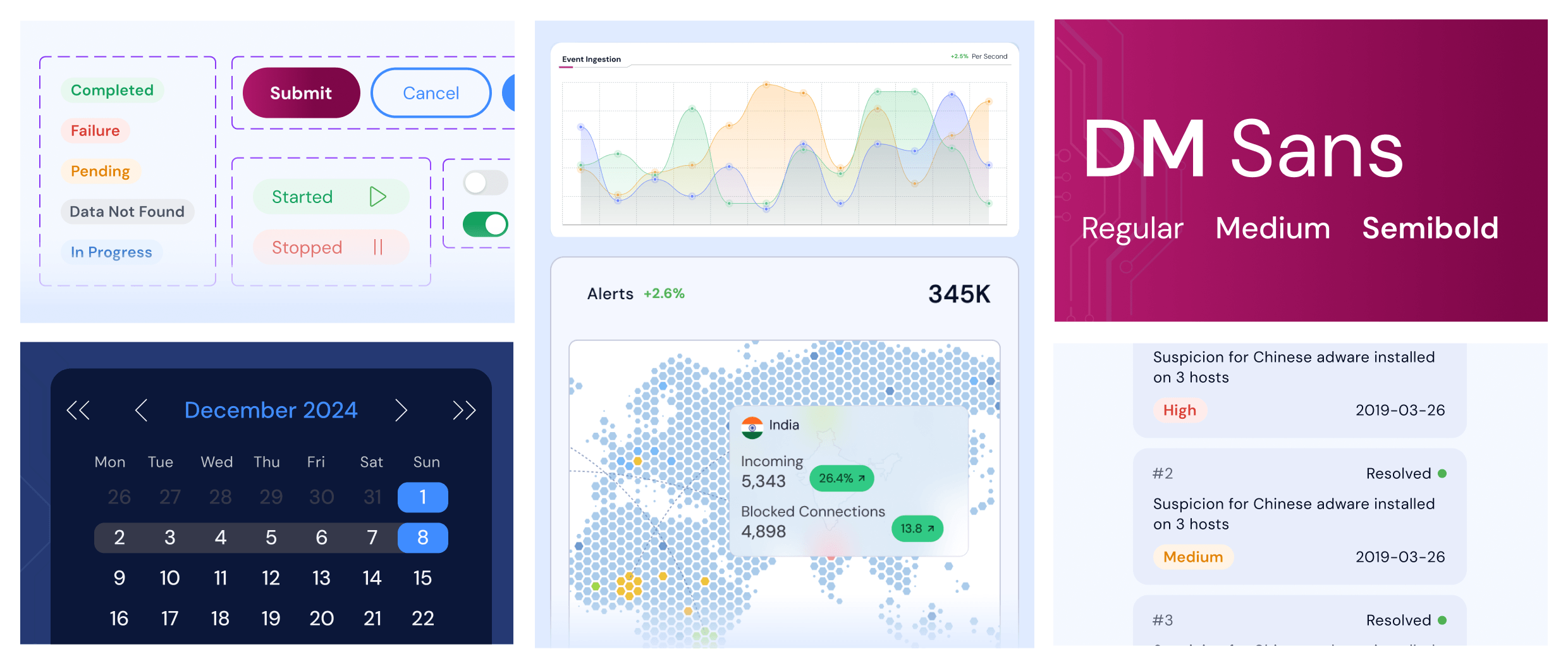
We developed a scalable design system for Socleus using Figma Variables, creating reusable components and synchronized light and dark themes from a single source of truth. This improved consistency, reduced maintenance effort, and prepared the platform for future scale.
Tario
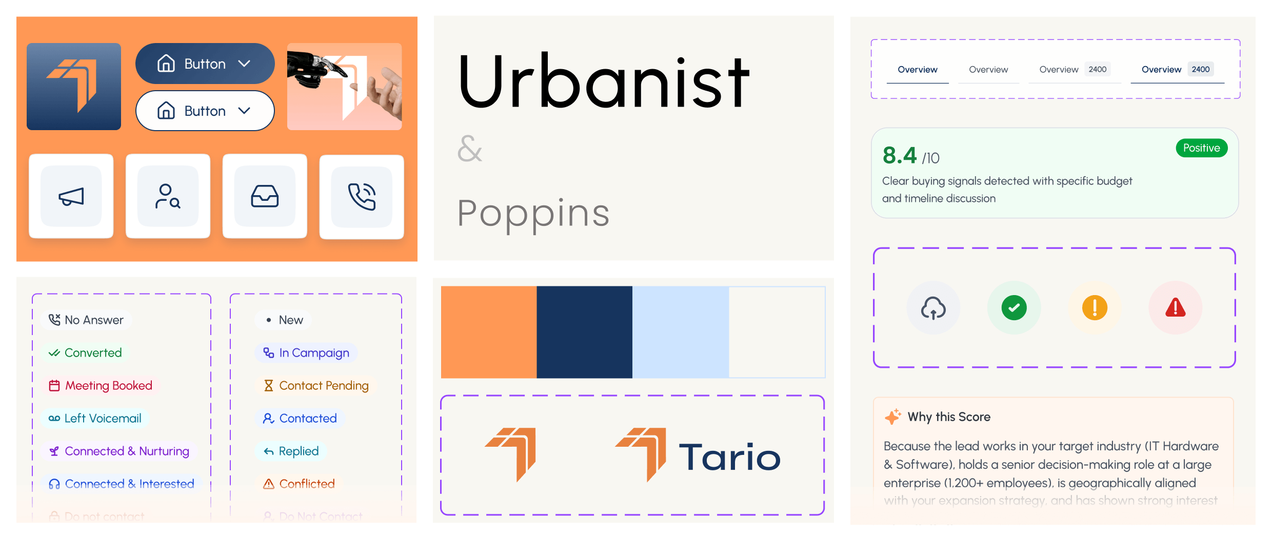
For Tario, we built a scalable design system for a vast AI powered product, defining reusable components and states for how AI responds, scores, recommends, and communicates outcomes. The system created a cohesive and consistent experience across complex workflows, while supporting accessibility, faster delivery, and long term product scalability.
Tata Aig
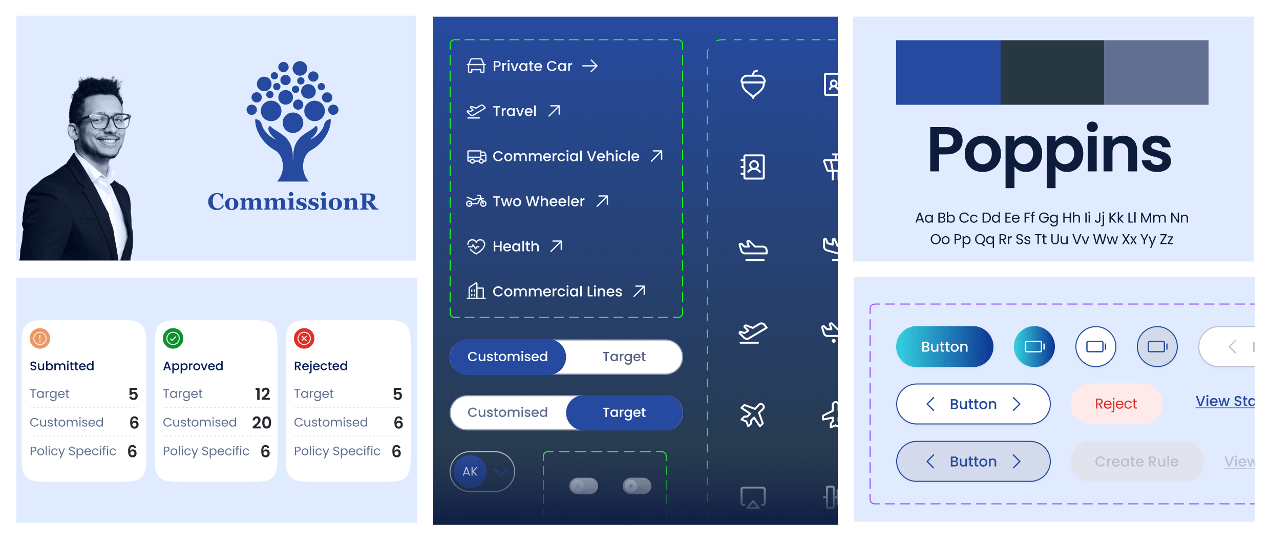
For Tata AIG, we built a scalable design system for a complex insurance platform, standardising components, states, typography, iconography, and interaction patterns across diverse insurance workflows. Designed for accessibility, consistency, and multi product scalability, the system enabled faster delivery while keeping complex operational experiences cohesive.
Best & Less
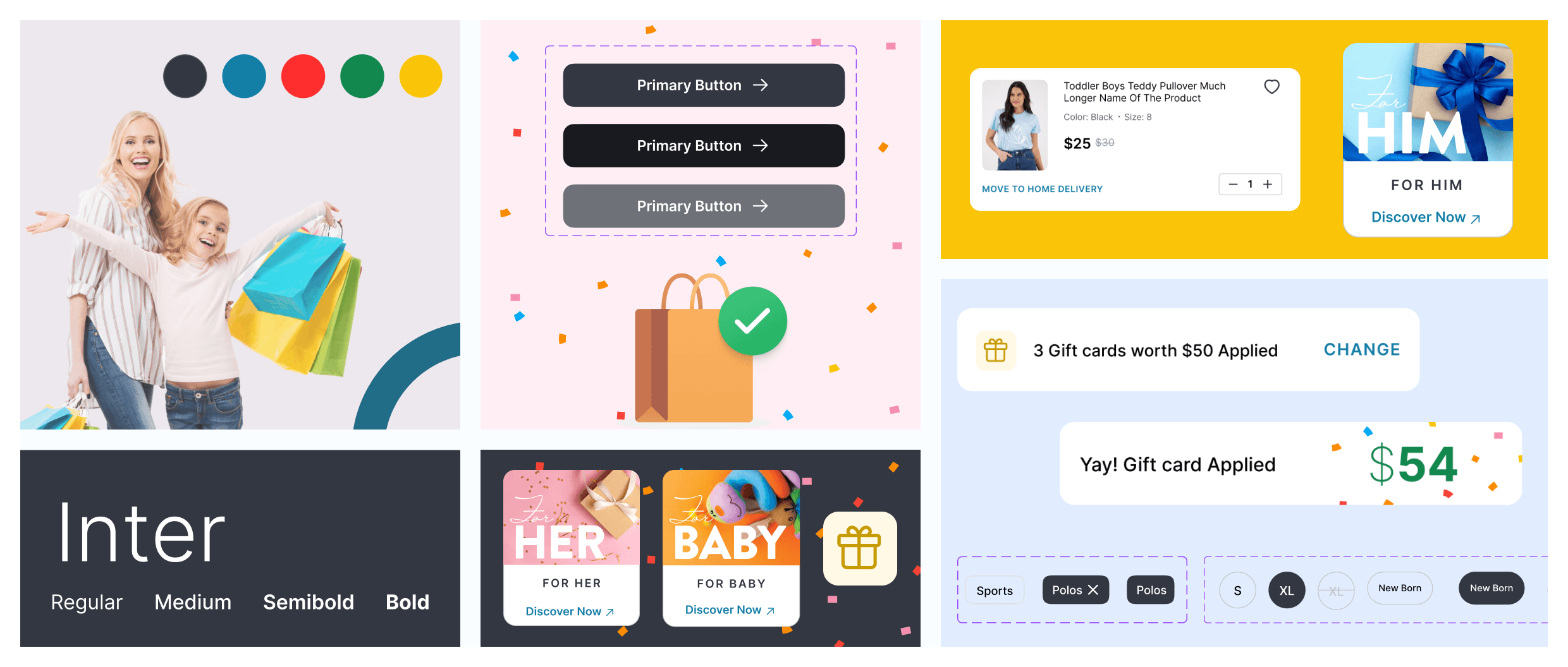
We established a scalable design system for Best&Less, bringing together design foundations, reusable components, and interaction patterns into a cohesive visual language. Built for both web and mobile, it streamlined collaboration and ensured consistency as the product evolved.
LytHouse
For this enterprise ESG platform, the challenge was designing a scalable system around complex data, reporting requirements, and varying content constraints. We defined clear component behaviours, spacing, typography, colour states, and information hierarchy to ensure the right data remained readable, accessible, and consistent across dense enterprise workflows.
Why companies choose Feelpixel for research & strategy
Every branding engagement begins with understanding your business, audience, market position, and growth goals so every design decision has a clear purpose.
Strategy Before Design
Every industry, audience, and business model has different branding needs. We align positioning, communication, and identity decisions with real business objectives rather than following design trends.
Context Matters
People connect with stories before they connect with products. We help brands communicate with clarity, emotion, and authenticity to create meaningful and lasting customer relationships.
Creative Storytelling
We build scalable brand systems that work across websites, products, social media, presentations, marketing campaigns, and future growth initiatives.
They’ve helped us better understand our users, scale our design system, and improve customer experience and conversions.
Working with Feelpixel has been a great experience. Over the past 8–9 months. What sets them apart is their ability to align business goals with user needs, while maintaining the speed startups expect. The fact that we continue to engage them on new projects speaks for itself. Wishing the team all the best ahead!
Feelpixel's expertise and collaboration helped us transform our end-user experience.
They not only redesigned the website but also ensured that every element from navigation to registration flows and custom illustration was tailored to user needs. We truly appreciate their creativity, attention to detail, and collaborative approach. Highly recommend them for anyone looking to elevate their online presence.
Feelpixel’s Mobile-first design strategy has driven significant growth in conversion rates and average transaction value
Our website now boasts a modern, streamlined, and cleaner web app. Their professional approach, meticulous implementation of our requirements and in-depth understanding of online users have resulted in a cohesive and intuitive user experience across all devices. We highly recommend Feelpixel for their exceptional design expertise and their ability to deliver impactful results.
Their understanding of sustainability frameworks and impact reporting helped us create a user-focused product
Feelpixel’s knowledge of KPI visualisation, in the form of impact assessments and materiality matrices, really made the product experience more intuitive and impactful. Their understanding of sustainability frameworks and impact reporting helped us create a user-focused product that meets both analytical and strategic needs.
Their understanding of sustainability frameworks and impact reporting helped us create a user-focused product
Feelpixel’s knowledge of KPI visualisation, in the form of impact assessments and materiality matrices, really made the product experience more intuitive and impactful. Their understanding of sustainability frameworks and impact reporting helped us create a user-focused product that meets both analytical and strategic needs.
What does Feelpixel include in a design system project?
We can cover the foundations, components, patterns, variables, documentation, and governance needed for your product. The exact scope depends on the maturity of your existing system and what your team needs to use it effectively.
Can you build a design system from scratch?
Yes. We can build the system from the ground up, starting with the visual foundations and moving into reusable components, patterns, documentation, and guidelines for your product team.
Can you improve our existing design system?
Yes. We can work with an existing system rather than replacing it unnecessarily. We review the current library, identify gaps and inconsistencies, and improve the areas that need attention based on your product and team requirements.
Will the design system team work with our development team?
Yes. We work closely with developers during the process so that components, variables, naming, states, and usage guidelines are practical to implement. We can also help align the design system with your existing technical setup.
How long does a design system project take?
The timeline depends on the size of the product, the current state of your design system, and how much needs to be built or documented. We define the scope and phases after understanding the product and team setup.
How much does a design system cost?
The cost depends on the product scope, number of components, existing design foundations, documentation needs, and timeline. A discovery call helps us understand what is already in place and recommend the right scope and engagement for your team.