Redesigning Cosign’s Digital Presence: How We Built a Website for a Global Signage Brand Serving Multiple Countries

A collage-style screenshot of a signage company’s website homepage, showing multiple sections such as product cards, customer testimonials, sector examples, a large hero banner about signage systems, and catalog/download call-to-action panels.
How Feelpixel solved navigation complexity, multiple buyer types, and global local credibility for one of the world’s leading architectural signage manufacturers.
When a brand has been manufacturing precision signage systems for over 30 years, ships to more than 100 countries, and serves everyone from hospital architects to airport project managers, its website carries an enormous amount of weight. It has to be a product catalogue, a technical resource, a trust signal, and a sales tool all at once for buyers who arrive with very different needs and very little patience.
That was the challenge Cosign brought to Feelpixel.
Cosign, headquartered in Belgium with offices in India, Mexico, and Sweden, is one of the world’s most established architectural signage manufacturers. Their product range spans indoor modular systems, outdoor totems, illuminated displays, LED solutions, eco friendly frames, and digital signage distributed through a global partner network and specified by architects, sign makers, and project owners across healthcare, aviation, education, retail, hospitality, and public infrastructure
The previous website did not reflect any of that. It felt generic, hard to navigate, and disconnected from the quality of the products it was supposed to represent. Our task at Feelpixel was to fix that not by adding more to the website, but by making what was already there infinitely easier to find, understand, and act on.

The Core Challenge

From the beginning, the redesign focused on solving three major UX problems:

  1. Serving multiple buyer types with completely different needs
  2. Making a highly complex product catalogue feel intuitive
  3. Articulating global credibility

Each of these problems affected how users discovered products, built trust, and ultimately contacted the brand.

Challenge 1: Designing for Multiple Buyer Types

One of the biggest mistakes in B2B web design is assuming every visitor behaves the same way.
That is rarely true in the signage industry.
Cosign’s audience includes:

  • Architects searching for systems that fit a spatial environment
  • Sign makers looking for technical specifications and profile codes
  • Project owners evaluating long term manufacturing and implementation capabilities

Each of these users arrives with different expectations. An architect wants to see signage installed in real environments. A sign maker wants dimensional details and installation guidance. A project owner wants proof of credibility through case studies and sector experience.

Instead of forcing every user into the same journey, Feelpixel structured the website around layered intent a core principle of user-centred design.

What We Changed

The contact and enquiry flow became more contextual.
Before submitting an enquiry, users identify themselves as:
  • Architect
  • Sign Maker
  • Project Owner
This small interaction immediately personalises the experience and signals that the website understands who they are.
The homepage was also restructured around progressive information hierarchy.

Instead of overwhelming visitors with product depth immediately, the experience gradually moves through:

  1. Brand credibility
  2. Product systems
  3. Industry sectors
  4. Case studies
  5. Enquiry paths

This creates a more natural decision making flow for first-time visitors.

Sector Focused Experiences

We also designed dedicated sector pages for industries like:
  1. Healthcare
  2. Aviation
  3. Retail
  4. Education
  5. Corporate spaces
  6. Public infrastructure
This creates a more natural decision making flow for first-time visitors.
Each page was built around the actual operational needs of that industry.
For example, healthcare buyers care about durability, hygiene, navigation clarity, and accessibility. Airport projects prioritise scale, multilingual navigation, and visibility across large environments.
Instead of generic messaging, each sector page included:
  • Relevant product systems
  • Real project photography
  • Industry specific FAQs
  • Related case studies
  • Direct enquiry pathways
This helped users feel understood without increasing complexity.

Challenge 2: Making a Complex Product Range Feel Navigable

Cosign’s product ecosystem is extensive indoor modular systems, illuminated displays, textile frames, outdoor signage, LED products, eco friendly solutions, tension systems, pavement signs, and multiple accessory categories. On the previous website, this depth felt overwhelming.

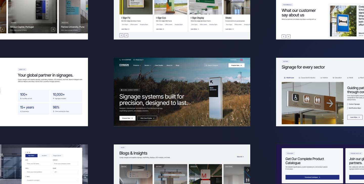
Feelpixel’s redesign focused heavily on information architecture and navigation clarity.

Building a Two Layer Navigation System

We designed the navigation in two levels.
The first level grouped products by how buyers naturally search:
  • Indoor Signages
  • Outdoor Signages
  • LED Products
  • Displays
  • Exit Signs
  • Eco Friendly Systems
This supports users who begin with application level intent.
The second level introduced deeper technical categorisation.
Inside Indoor Signages, users could navigate into:
  • Modular Sign Systems
  • Flexible Sign Systems
  • Illuminated Systems
  • Textile Frames
  • Fixing and Suspension Kits
This layer was designed primarily for technical buyers and sign makers who already understand system families.

Reducing Discovery Friction

Several interaction improvements were introduced across the navigation experience:
  • Mega menus with visual grouping
  • Hover previews with product imagery
  • Scroll based browsing on category pages
  • Card based layouts for fast comparison
  • Structured product hierarchy for easier scanning
The goal was simple.
Users should never feel lost while browsing a large catalogue.

Product Page Structure

Product pages were redesigned using progressive disclosure a technique that surfaces information in layers matched to user intent, rather than front loading everything at once.
The experience starts with:
  • Large scale installed photography
  • Product overview
  • Use case context
As users scroll deeper, they discover:
  • Technical specifications
  • Profile dimensions
  • Accessories
  • Installation videos
  • Downloadable catalogues
  • System configurations
This structure allows the same page to work for multiple user types.
Architects can focus on visual applications and environments. Technical buyers can access specifications without unnecessary friction.

Challenge 3: Balancing Global Scale with Local Relevance

Cosign operates globally, but buyers still want local confidence. A hospital project manager in India and an architect in Belgium both need to feel that the company understands their market, regulations, and project expectations.
Many multinational B2B brands struggle here they either become too generic globally or too fragmented regionally. Feelpixel solved this through structural clarity rather than separate experiences.

Establishing Global Credibility

The website prominently surfaces:
  • 30+ years of manufacturing expertise
  • Presence across 100+ countries
  • Thousands of installations
  • International partner networks
  • Sector specific experience
These trust indicators appear across the experience rather than being hidden inside a corporate page.

Making the Local Presence Feel Real

At the same time, regional accessibility was made more visible.
The website highlights offices across:
  • Belgium and Europe
  • India
  • Mexico
  • Sweden
Local contact information, operating hours, and regional communication pathways help buyers feel they are interacting with a reachable team rather than a distant global entity.
Case studies strengthened this further.
Projects such as Amrita Hospital, Navi Mumbai International Airport, and Flames University demonstrated that Cosign’s work spans industries, geographies, and project scales.
This combination of global authority and local accessibility became one of the strongest trust drivers on the site.

The Visual Direction

Beyond UX and navigation, the redesign also required a complete visual repositioning.
The previous website looked generic and interchangeable.
For a brand involved in major healthcare campuses, airports, and premium architectural environments, that created a credibility gap.

Product First Design Language

Feelpixel’s new visual direction focused heavily on installed product photography. Instead of relying on isolated product renders, the experience showcased signage systems inside real architectural environments immediately helping users understand scale, material quality, environmental fit, and design precision.
This immediately helped users understand:
  • Scale
  • Material quality
  • Environmental fit
  • Design precision
The products became the hero of the experience.

A More Structured Interface

The interface itself was intentionally restrained. We used:
  • Clean typography
  • Spacious layouts
  • Structured grids
  • Minimal visual noise
  • Controlled interaction patterns
Micro interactions such as hover transitions, expandable content blocks, and smooth scrolling galleries added responsiveness without becoming distracting.

The overall objective was for the interface to feel precise, engineered, and premium, just like the products themselves.

What the New Website Delivers

The redesigned website now functions as a practical business tool rather than just a digital brochure.
Architects can quickly browse systems by application, explore installed environments, and download technical resources.
Sign makers can access profile codes, specifications, installation guidance, and product configurations more efficiently.
Project owners can validate sector expertise through case studies, understand the global scale of the company, and connect with the appropriate regional team.
The site also introduces SignAgent, Cosign’s cloud based sign management platform, more effectively than before.
This platform becomes particularly valuable for:
  • Large infrastructure projects
  • Multi building campuses
  • Facility management teams
  • Long term signage rollouts
Previously, this offering was buried within the website. The redesign positioned it as a meaningful value addition.

What This Project Demonstrates

The Cosign redesign demonstrates an important principle in B2B UX design that Feelpixel applies across every project: complex businesses don’t always need simplified websites. Sometimes they need better structured complexity.
The challenge was never reducing the scale of Cosign’s catalogue or limiting buyer pathways. The challenge was organising information in a way that felt intuitive regardless of who was using the site.

A hospital architect in Faridabad and an airport project manager in Brussels can now navigate the same website confidently, find what they need quickly, and understand why Cosign is a credible long term partner.

That is what effective B2B UX design and what Feelpixel should achieve: respecting the complexity of the business while ensuring users never feel overwhelmed by it.

Frequently Asked Questions

What makes UX design for signage websites different from regular corporate websites?
Signage websites typically serve multiple buyer types at once, including architects, sign makers, procurement teams, and project owners. Each group searches differently and requires different information depth. Good UX design structures the experience so technical specifications, visual references, and credibility signals are all easy to access without overwhelming the user.
The most effective approach is layered navigation. Products should first be grouped by how buyers naturally search, such as indoor signage, outdoor signage, or LED systems. Deeper technical categorisation can then help experienced buyers navigate specific system families more efficiently.
Different industries have different operational requirements. Healthcare projects prioritise accessibility and durability, while airports focus on scale and multilingual navigation. Sector specific pages help buyers quickly understand how the product systems apply to their environment.
Global manufacturing websites should balance international credibility with local accessibility. Buyers want to see large scale experience and trust signals, but they also want reassurance that there is a reachable regional team familiar with their market and project requirements.

Explore the Work

Visit the live Cosign websites at cosign.be and cosign.in to explore the redesign in context.

If you are a signage manufacturer, industrial B2B company, or global brand with a complex product ecosystem, Feelpixel would be glad to discuss what a strategic redesign could look like for your business.
share

Related blogs

Got a project in mind?