The Platform Had Everything. The Experience Needed to Catch Up.
Educational discovery platforms today contain massive amounts of content. Users explore courses across providers, universities, rankings, certifications, and learning paths, all within a single ecosystem. But access to content alone does not create a good learning experience
Fewer than 15% of newly onboarded users on a typical EdTech platform remain active just two weeks after sign-up. (NTQ Europe, 2025) And with average Massive Open Online Course (MOOC) completion rates sitting at just 3 to 6% globally (Gitnux, 2025), the pattern is clear, the problem is rarely the content. It is the experience around it.
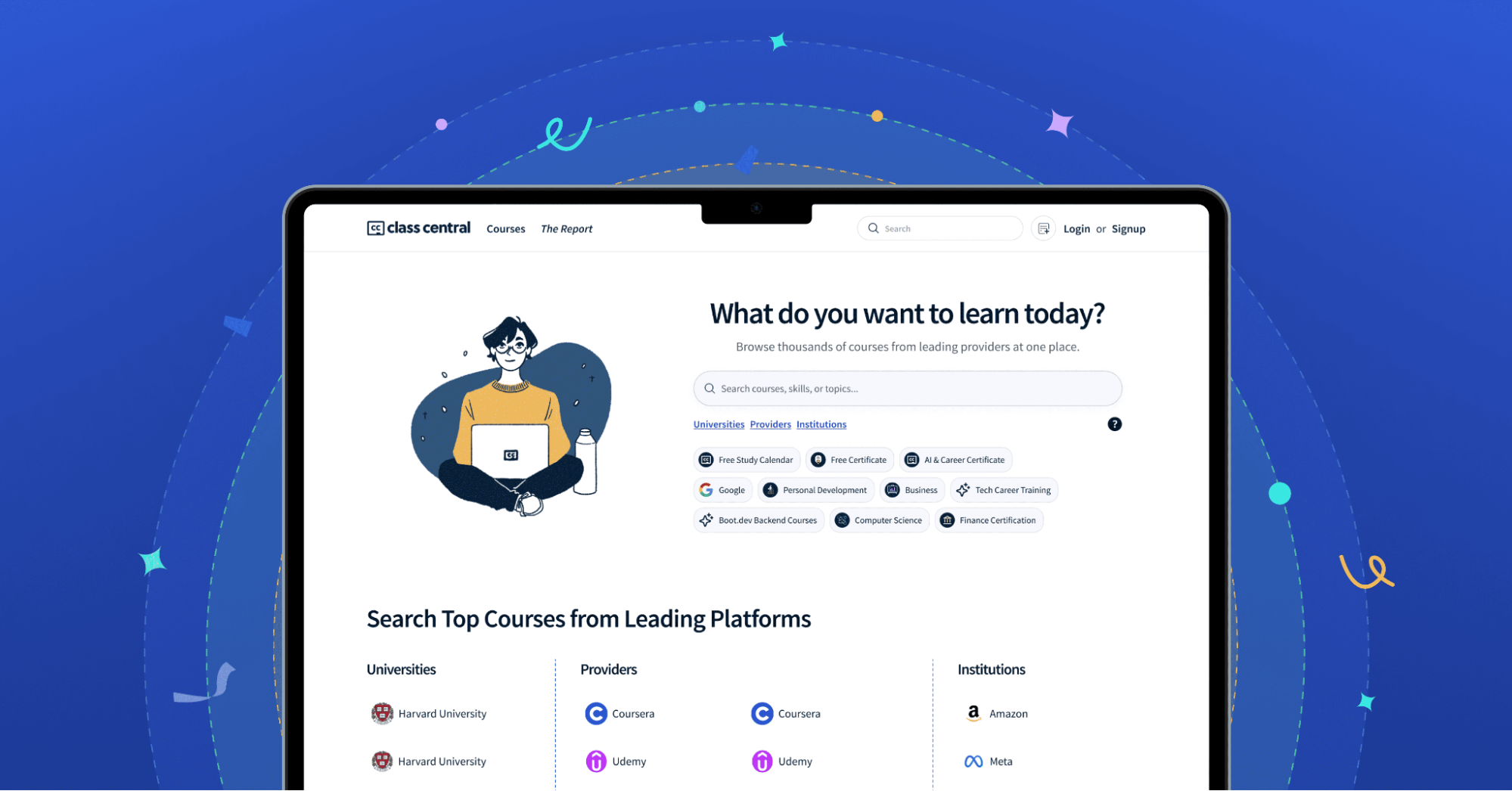
At Feelpixel, we explored these challenges while working with Class Central, based in Mountain View, California, a global course aggregator and discovery platform helping learners discover online courses from universities and learning providers worldwide.
The platform already offered strong educational value through thousands of courses, rankings, and learning opportunities. However, as the ecosystem scaled, the experience started feeling fragmented during important parts of the learner journey. Users were entering the platform with intent, but the experience did not always help them move forward confidently.
This raised an important UX question: How do you make large-scale educational discovery feel more guided, connected, and easier to navigate over time?
Where Did the Class Central Experience Start Breaking Down?
Before redesigning interfaces, we focused on understanding how learners interacted with the platform and where the journey started feeling disconnected.
Through UX audits, user interviews, analytics review, and competitor benchmarking, we identified three major experience gaps:
- Onboarding felt too broad
- Homepage exploration lacked direction
- Continuity weakened after sign-up
Interestingly, these were not isolated problems. Users were not only struggling with navigation, they were struggling with continuity across the ecosystem. The platform already had more content, information, and learning opportunities than most users would need. The real issue was that the experience felt scattered.
This became one of the biggest learnings during the project:
“Good UX does not always mean creating something entirely new. Sometimes the biggest impact comes from restructuring, reusing, and connecting what already exists.”
Why Was the Onboarding Experience Feeling Overwhelming?
The original onboarding experience asked users to immediately select from large topic lists after signing up. However, during research, we noticed that learners rarely entered the platform thinking in subjects first.
Most users were thinking:
- “I want to switch careers”
- “I want to improve professionally”
- “I want to explore something new”
But the onboarding experience pushed broad category selection too early. This created friction because users had to process too many decisions before understanding how the platform would help them. Research shows 72% of users abandon apps when onboarding requires too many steps. (UserGuiding, 2026)
The experience also lacked continuity with the rest of the ecosystem, once onboarding ended, users did not strongly feel that their choices were shaping the experience ahead.
How Did Feelpixel Redesign the Onboarding to Feel More Guided?
At Feelpixel, we shifted onboarding from broad subject selection to intent-based progression.
Instead of introducing large topic lists immediately, we first focused on understanding why users wanted to learn, what kind of learning they were looking for, and whether they were casually exploring or intentionally skill building. We broke onboarding into fewer, intent-based steps so users only focused on one decision at a time, reducing cognitive overload early in the journey.
However, one of the most important improvements was not adding new components. It was creating stronger continuity using the existing ecosystem. We intentionally reused illustration styles, visual patterns, layout structures, onboarding cues, and interaction behaviours across onboarding, homepage banners, profile completion, and promotional experiences.
This helped users feel visually anchored throughout the platform instead of feeling like they were navigating disconnected screens. The goal was simple, users should always feel guided, familiar, and connected while moving through the ecosystem.
This created stronger onboarding continuity, smoother exploration, reduced disorientation, better visual recognition, and more cohesive learner journeys.
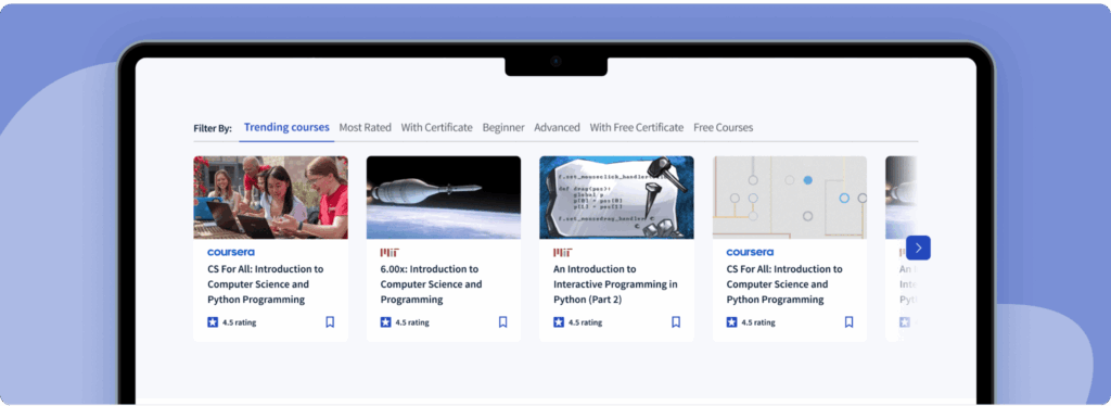
Why Did the Homepage Exploration Need Restructuring?
The homepage already contained valuable educational content, rankings, and promotional sections. However, too many elements competed for attention at once. Users struggled to understand where to focus, what to explore next, and which actions mattered most.
One insight became very clear during our review:
“Users were spending more time understanding the interface than exploring courses.”
How Did Feelpixel Restructure the Homepage?
At Feelpixel, we approached the homepage as a guided discovery layer instead of a content container. Rather than redesigning everything from scratch, we followed a structured process:
- Audit the existing hierarchy We mapped every section on the homepage to understand what was competing for attention and why users were losing direction during exploration.
- Prioritise sections by learner intent We restructured the layout to surface what mattered most to users arriving with different goals, reducing noise and creating a clearer visual path through the page.
- Improve CTA visibility and scanning behaviour Key calls to action were repositioned and made more prominent so users could act without having to search for the next step.
- Reposition promotional banners Instead of treating banners as interruptions, we repositioned them as contextual navigation cues, helping users discover relevant sections of the platform naturally.
- Connect the ecosystem visually Homepage sections, promotional banners, onboarding flows, and profile experiences were unified through: Cohesive Design System: A shared set of illustration styles, layout structures, and interaction patterns applied consistently across the platform so every screen feels like part of the same experience, reducing cognitive load and building visual familiarity across sessions.
This helped users feel less cognitively overloaded, more familiar with the experience, and more confident while exploring. The platform already had the right educational value. Our focus was helping users navigate that value more naturally.
Why Does Continuity Matter in Educational Products?
One of the biggest UX gaps we observed in educational products is that continuity often weakens after onboarding. Many platforms focus heavily on acquisition and sign-up experiences, but once users start exploring deeper, the experience loses momentum.
At Class Central, users lacked enough signals that the platform remembered or understood their learning journey. This became an important area of exploration during the project. We began mapping out directions and concepts worth pursuing, including progression-based experiences, continuity-driven interactions, lightweight gamification, and stronger ecosystem consistency.
These were conceptual directions rather than fully implemented solutions but they surfaced a clear design principle: small continuity cues can make large educational systems feel significantly easier to navigate and return to.
What Did Feelpixel Learn From the Class Central Project?
Working on Class Central reinforced an important insight for us at Feelpixel, educational platforms do not become difficult because of lack of content. They become difficult when experiences feel disconnected.
This project also reinforced something equally important, UX is not always about adding more. Sometimes the most impactful design decisions come from using existing systems more thoughtfully. Less noise can also create a bigger impact.
Class Central already had strong educational value, useful UI elements, and rich visual assets. Our role was not to replace them. It was to structure them more intentionally and create stronger continuity across the ecosystem.
By making onboarding, exploration, banners, profile completion, and interaction patterns feel visually connected, the overall experience started feeling more guided and learner-centred.
The future of educational discovery platforms will not depend only on access to content. It will depend on how confidently users can move through that content.
“The strongest EdTech platforms will not simply provide educational resources, they will guide learners meaningfully throughout the journey.”
We hope this blog gives you a clearer understanding of how applying the right UX research methods and processes can untangle complex EdTech challenges.
Frequently Asked Questions
What makes course discovery platforms different from other EdTech products?
Course discovery platforms deal with a unique challenge helping users navigate massive amounts of content across providers, universities, and learning paths. The UX problem is not about teaching; it is about guiding users to the right starting point confidently.
Why does onboarding matter so much on a course discovery platform?
Because users arrive with a goal, not a category in mind. If onboarding asks too much too soon, users disengage before they even experience the platform’s value. Intent-based onboarding bridges that gap.
How do I make my e-learning platform easier to use?
Start with understanding why users are coming to the platform before asking them to make choices. Simplify onboarding into fewer, intent-driven steps. Ensure visual consistency across every screen so users feel oriented. And create continuity signals that help users pick up where they left off.
What is the role of visual consistency in large educational ecosystems?
When illustration styles, layouts, and interaction patterns are reused across onboarding, homepage, and profile experiences, users feel anchored throughout the platform. It reduces cognitive load and builds familiarity without users consciously noticing it.
Why does continuity weaken after onboarding on most platforms?
Most platforms invest heavily in acquisition and sign-up flows but deprioritise what happens after. Without signals that the platform remembers the learner’s journey, users feel like they are starting over each session.
What was the biggest learning from the Class Central project?
That the most impactful UX decisions are not always about adding something new. Restructuring, reusing, and connecting what already exists can create a more guided and cohesive experience than building from scratch.
How do UX research methods help improve an EdTech platform?
UX audits reveal where the experience is losing users. User interviews uncover why. Analytics show where drop-off happens. And competitor benchmarking shows what better looks like. Together, they build a research foundation strong enough to make design decisions with confidence, not assumption.
Explore More EdTech Work
Work with Feelpixel
Feelpixel Design Agency helps EdTech brands build high-conversion digital experiences through UX strategy, design systems, and product-focused UI design.
Let’s shape the future of learning, one experience at a time.