Cart abandonment isn't a pricing problem. It's a design problem.
In this blog, we are walking you through the exact thinking and interventions that helped us reduce cart abandonment by 40% for an e-commerce brand and why the same principles apply across every category we have worked in, from automotive to healthcare to fast fashion.
Why most checkout experiences fail users at the worst possible moment
- Developers build them to satisfy business requirements: collect the address, collect payment, confirm the order. The user’s emotional state during that process, their anxiety about security, their confusion over form errors, their frustration at being forced to create a password just to buy a pair of sneakers, none of that makes it into the technical spec. So what you end up with is a checkout that technically works but practically leaks.
- There is friction at every step: Too many fields to fill, no real-time error feedback, confusing field labels, no clear indication of how many steps are left. Each small friction point reduces buying intent just a little, and by the time the user reaches the payment screen, the accumulated frustration is enough to tip them toward abandoning.
- Trust signals are missing or poorly placed: Users are being asked to hand over their card details to a brand they may have found that morning via an Instagram ad. At that moment they need reassurance, a security badge, a clear return policy, a review or two from someone who actually received the product. Instead, most checkouts bury this information or leave it out entirely.
- The mobile experience has not been properly designed: Over 60% of e-commerce traffic now comes from mobile devices, according to Statista. Yet most checkout flows were designed on desktop and then squeezed onto smaller screens rather than properly reimagined for how people actually shop on their phones. The result is tiny tap targets, keyboards that cover input fields, and CTAs that fall below the fold.
And there is almost never a recovery moment. Brands spend heavily on acquisition but invest almost nothing in the design of what happens when a user shows signs of leaving the checkout.
There is no graceful save point, no reassurance, no moment that says:
“You were almost there, and it’s worth finishing.”
How we approach this at Feelpixel
We treat cart abandonment as a design systems problem, not a marketing problem. That framing matters because it changes what you look at, what you fix, and how you measure success.
Start by finding where users actually leave
In almost every project we have worked on, the majority of abandonment traces back to one or two specific moments in the flow. When you know which moments those are, you stop guessing and start fixing the right things. That alone accelerates results significantly.
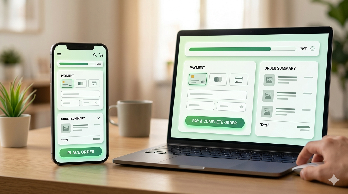
Make the checkout feel effortless
The goal is to reduce the number of decisions and the amount of effort required to complete the purchase.
- Guest checkout should be the default and the hero of the page. Forcing users to create an account before they can buy is one of the single biggest abandonment drivers in e-commerce. Making guest checkout prominent and moving account creation to an optional post-purchase step, routinely lifts completion rates by 25 to 30% on its own.
- Inline validation matters more than most teams realise. When a user fills in a form field incorrectly, they should know about it the moment they move to the next field, not when they hit submit and the whole page reloads with a list of errors.
- The Nielsen Norman Group’s research shows that inline validation can improve form completion rates by up to 22%. That is a meaningful lift from a single UX change.
- Progress indicators reduce checkout anxiety. When users can see that they are on step 2 or 3, they are far more likely to push through than if they feel like the checkout might go on forever. Showing people where they are gives them a sense of control and a visible finish line.
- Smart defaults and auto-fill reduce the perceived effort of buying. Address auto-complete, saved payment methods, and auto-detected country and currency all make the checkout feel like it is working with the user rather than demanding things from them.
Build trust at the exact moment it matters most
Trust is the most underrated conversion lever in e-commerce, and nowhere does it matter more than at the payment step.
We place security badges and SSL indicators close to the payment form, not in the footer where no one looks.
Return policy information has to be visible and scannable without the user having to hunt for it. If there are customer reviews available, some of them should be visible during checkout, not just on the product page. And a money-back guarantee or free returns callout near the CTA button does a quiet but powerful job of reducing purchase anxiety.
Design mobile checkout as its own experience
Designing for mobile properly means thinking carefully about tap target sizes so users can select fields and options without zooming in. It means the order summary should be collapsible so it does not push the buy button below the fold. It means input fields should trigger the right keyboard type so that phone number fields open a numeric keypad instead of a full keyboard. And the CTA should stay sticky at the bottom of the screen so the user always has a clear path forward without scrolling.
Design what happens when someone is about to leave
- The checkout experience does not end at the payment form. We also design what happens in the moments when users are showing signs of leaving, when their mouse drifts toward the back button, when they have been inactive for a while, or when they start scrolling upward.
- An exit intent message does not need to offer a discount. Often the most effective message is simply: “Your cart is saved. You can come back anytime.” That small reassurance removes one of the silent reasons people abandon, the belief that they will have to start over if they leave.
- Persistent carts across sessions make sure returning users do not lose their progress. And if the user has already entered their email address, a well-designed cart recovery email sequence can bring a meaningful percentage of them back to complete the purchase.
The work we have done across e-commerce
This is something we have learned across years of working with brands in very different spaces.
Each of these projects reinforced the same underlying truth. Cart abandonment is a symptom.
The cause is almost always a gap in trust, clarity, or ease at a specific point in the user journey, and it is findable and fixable when you look for it properly.
What the results look like
Here is a summary of outcomes across Feelpixel e-commerce engagements:
| Metric | Before | After | Change |
|---|---|---|---|
| Cart Abandonment Rate | ~68% | ~41% | 40% reduction |
| Checkout Completion Rate | 32% | 51% | 59% improvement |
| Mobile Conversion Rate | 1.4% | 2.6% | 85% lift |
| Bounce Rate on Checkout Page | 44% | 28% | 36% reduction |
| Average Session Duration | 2m 14s | 3m 42s | 65% increase |
Results are aggregated across multiple Feelpixel e-commerce projects. Specific outcomes vary by brand, category, and starting baseline.
What the best checkout experiences actually have in common
- Brands that convert well are not doing something magical. They are just doing a small number of things consistently and correctly.
- They reduce the number of decisions the user has to make. Every unnecessary field, every optional but displayed step, every moment where the user has to figure out what to do next is a conversion risk. The best checkouts feel like they are helping the user through the process rather than collecting information from them.
- They surface the right trust signal at the right moment. A security badge near the payment field. A return policy near the CTA. A review near the product summary. These things only work when they appear at the moment the user needs reassurance, not buried in a footer or presented in a block of legal text.
- They treat mobile as the primary experience. Not an adaptation. Not a scaled-down version of desktop. A genuinely designed experience for someone using their phone with one hand, probably while doing something else.
- They design for recovery as well as for completion. Not every user will convert on the first attempt. The brands that do best have thought carefully about what happens when someone leaves and have made it easy and low-friction for them to come back.
- These are not trends. They are the practical application of how people actually behave when they are in the middle of making a purchase decision.
What a client said
“Our vision to transform the used car industry by using technology as a backbone of it. We wanted to solve genuine pain points that has never been solved before in this industry. I am really glad that Feelpixel got on board. They’ve been working with us for 8-9 months. They really helped us think through our users much more deeply. I am really happy with the outcome we have got so far.”
— Gajendra Jangid
Co-Founder & Chief Starmarketer, CARS24
Frequently Asked Questions
What is a reasonable cart abandonment rate to aim for?
What are the most common reasons users abandon their cart?
How long does a checkout redesign typically take?
Does a proper mobile checkout redesign really move the numbers?
How do you measure whether a checkout redesign has worked?
Let's look at your checkout together
Feelpixel is a product design agency, building scalable digital experiences across e-commerce, SaaS, healthcare, and fintech.
Work with Feelpixel
Every abandoned cart tells a story. The challenge is uncovering where users hesitate and why they decide not to complete their purchase.
At Feelpixel, we help ecommerce brands reduce cart abandonment through UX research, checkout optimisation, customer journey mapping, and conversion-focused design. From identifying friction points to creating seamless, trust-building experiences, we design journeys that help more shoppers become customers.
Let’s shape the future of learning, one experience at a time