The project focused on simplifying Kotak Life’s digital ecosystem, from discovering the right insurance product to calculating returns and managing existing policies. The conceptual design developed by Feelpixel as part of our response to a Kotak Life request for proposal (RFP) focuses on reducing friction across key customer journeys while creating a more guided, accessible, and connected experience for both new and existing customers.
Complex Information Made Insurance Difficult to Understand
The existing experience presented users with a large amount of information across products, categories, and services. For new customers, this could make it difficult to understand which policy suited their needs, what benefits were available, and how different plans compared.
02
Navigation and Information Hierarchy Needed More Clarity
The research identified opportunities to improve navigation and information hierarchy. Multiple dropdowns and sections could make it harder for users to locate specific information, while important actions and calls to action were not always given enough prominence.
03
Key Customer Actions Had Unnecessary Friction
Existing customers frequently needed to perform actions such as paying premiums, settling claims, managing policies, downloading documents, and finding support. The research highlighted opportunities to create clearer entry points and make these frequent actions easier to access.
Design Language
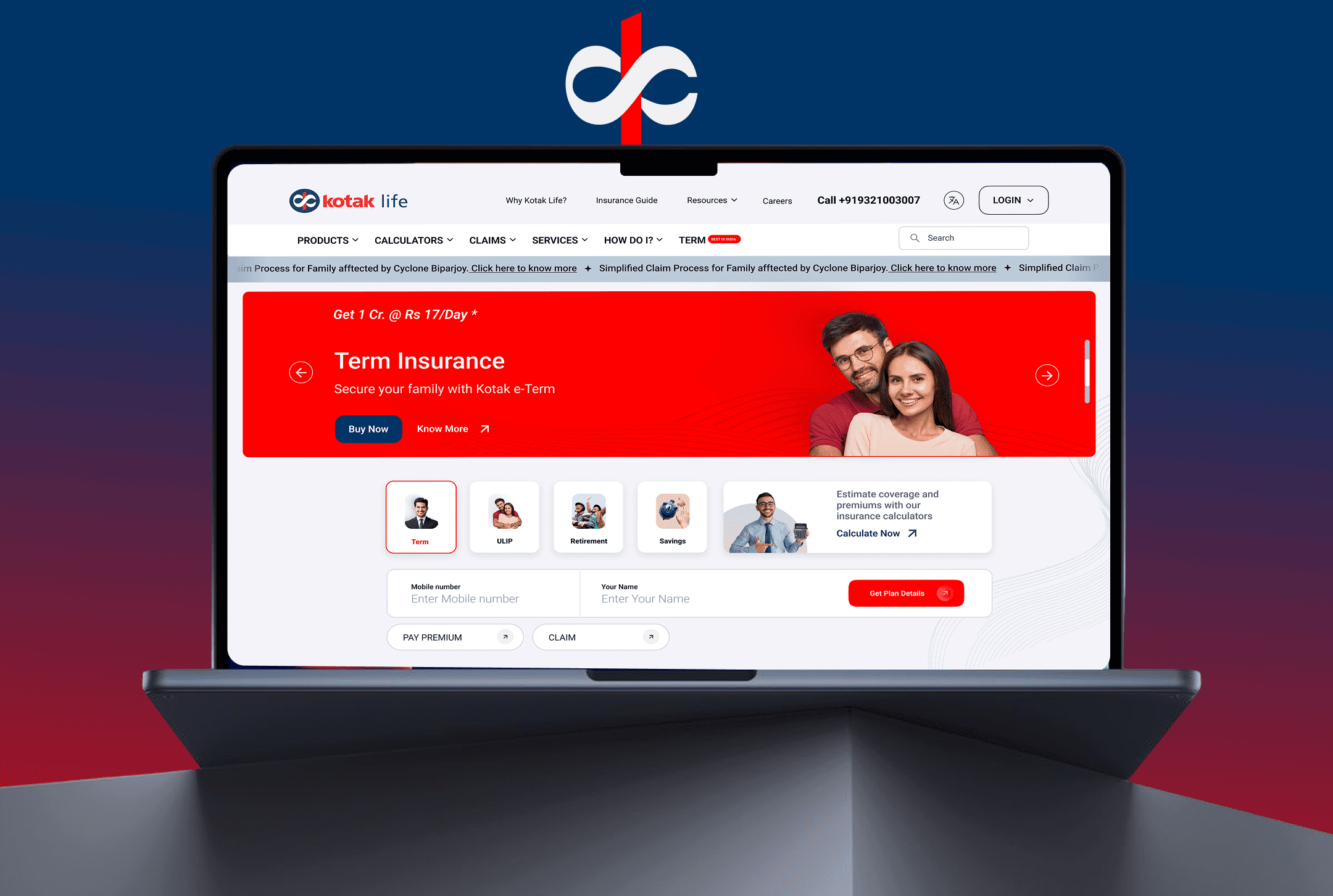
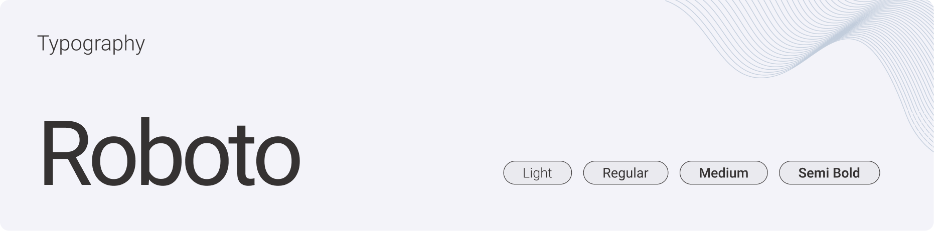
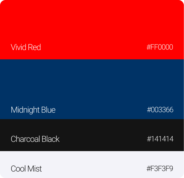
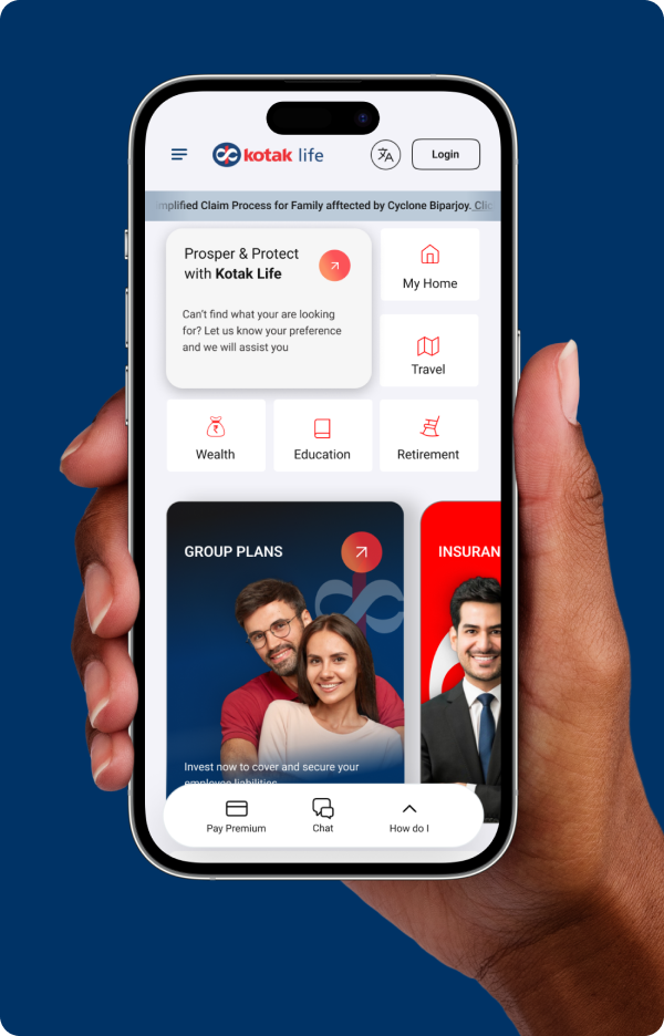
The visual direction combines Kotak Life’s established brand colours with a cleaner digital interface, structured cards, prominent CTAs, and clear content hierarchy. Red and blue create a strong visual foundation, while rounded cards, illustrations, icons, and photography add warmth to an otherwise information-heavy insurance experience.
Understanding the Market and Customer Needs
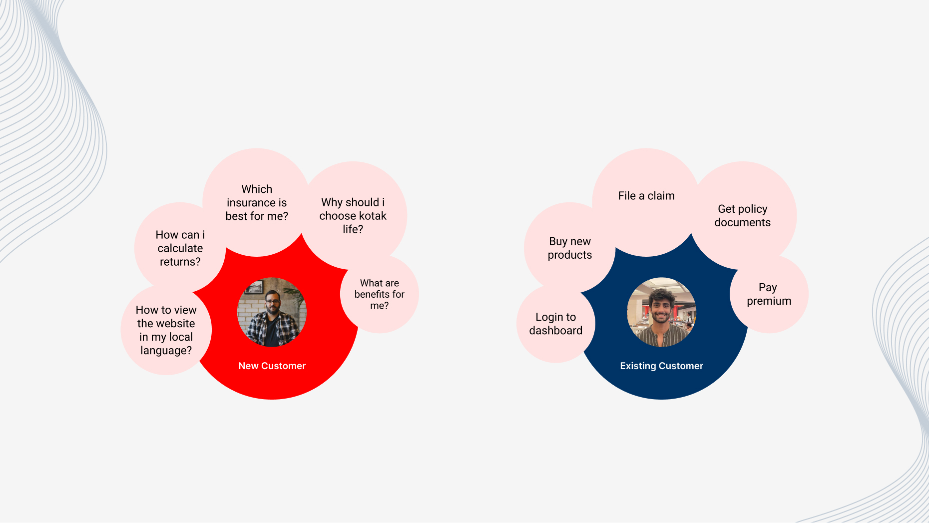
We studied the insurance market and competitor experiences to understand how products, trust signals, key information, and customer support are presented. We also looked at new and existing customers to understand their needs, from exploring policies and benefits to managing premiums, claims, and documents.
A More Guided Product Selection Experience
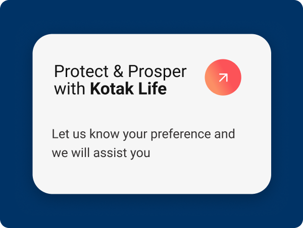
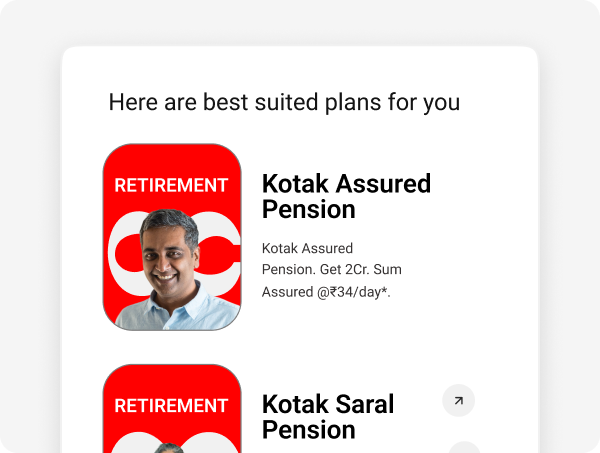
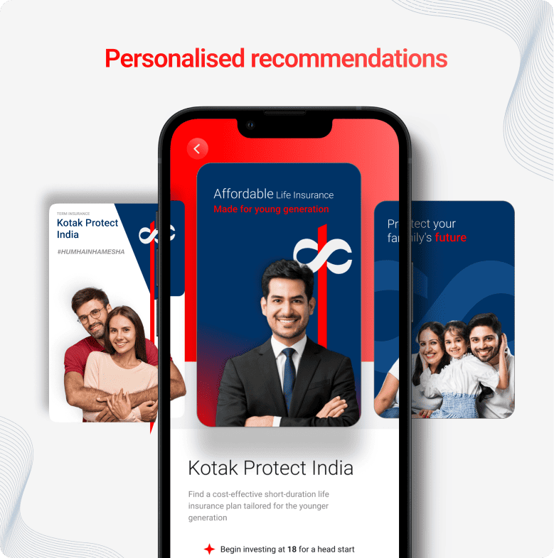
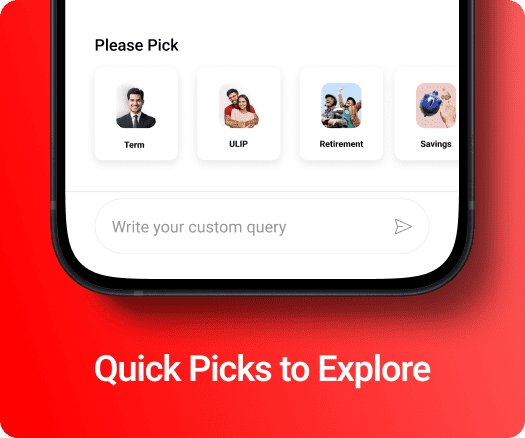
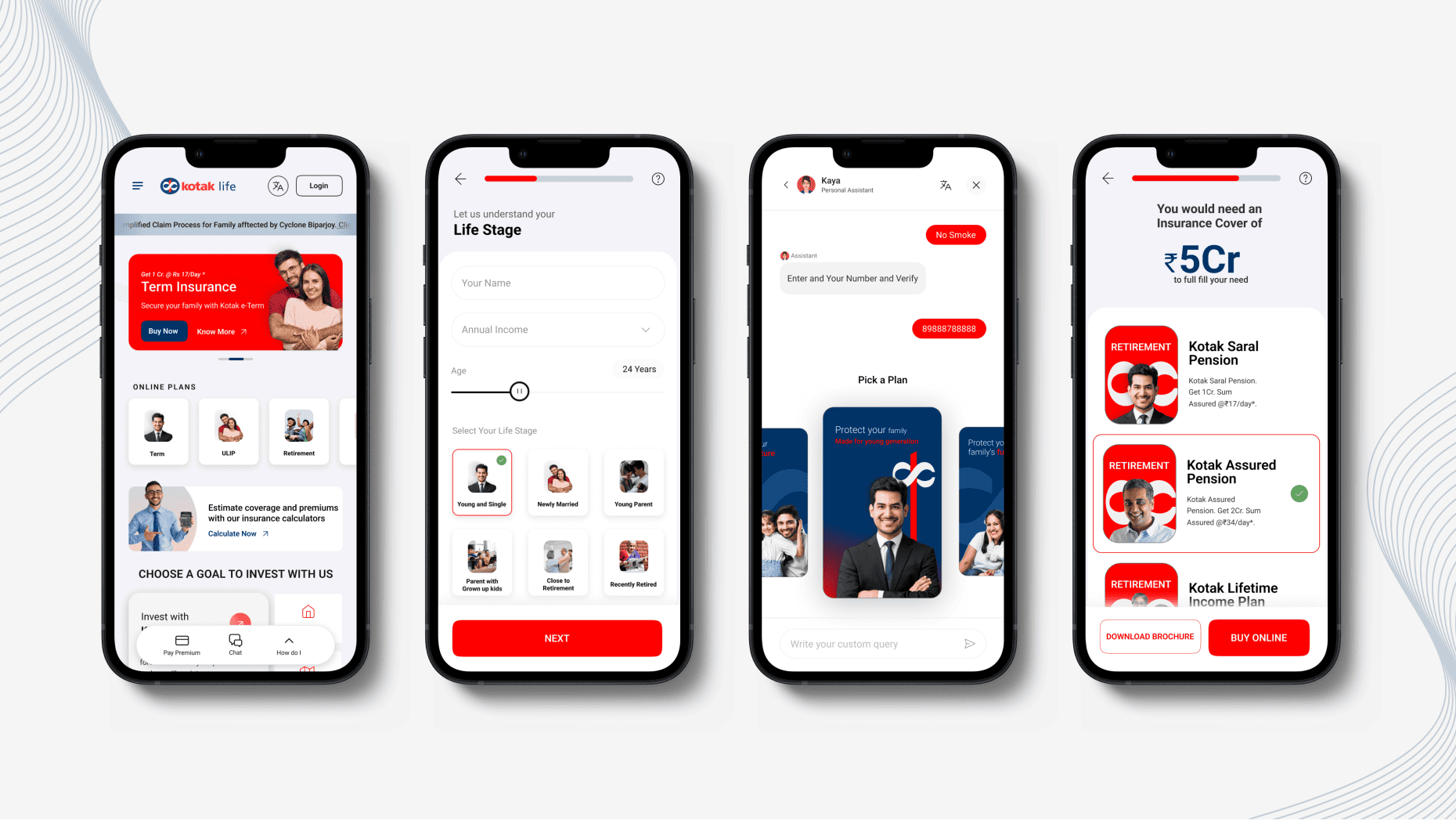
The design explores a more guided approach to insurance discovery. Instead of expecting users to understand every product independently, the experience gathers information about their goals, life stage, and risk profile to create a more relevant product discovery journey. Users can select a life goal, provide basic personal information, identify their risk profile, and receive product recommendations based on their needs.
Making Calculators Easier to Use
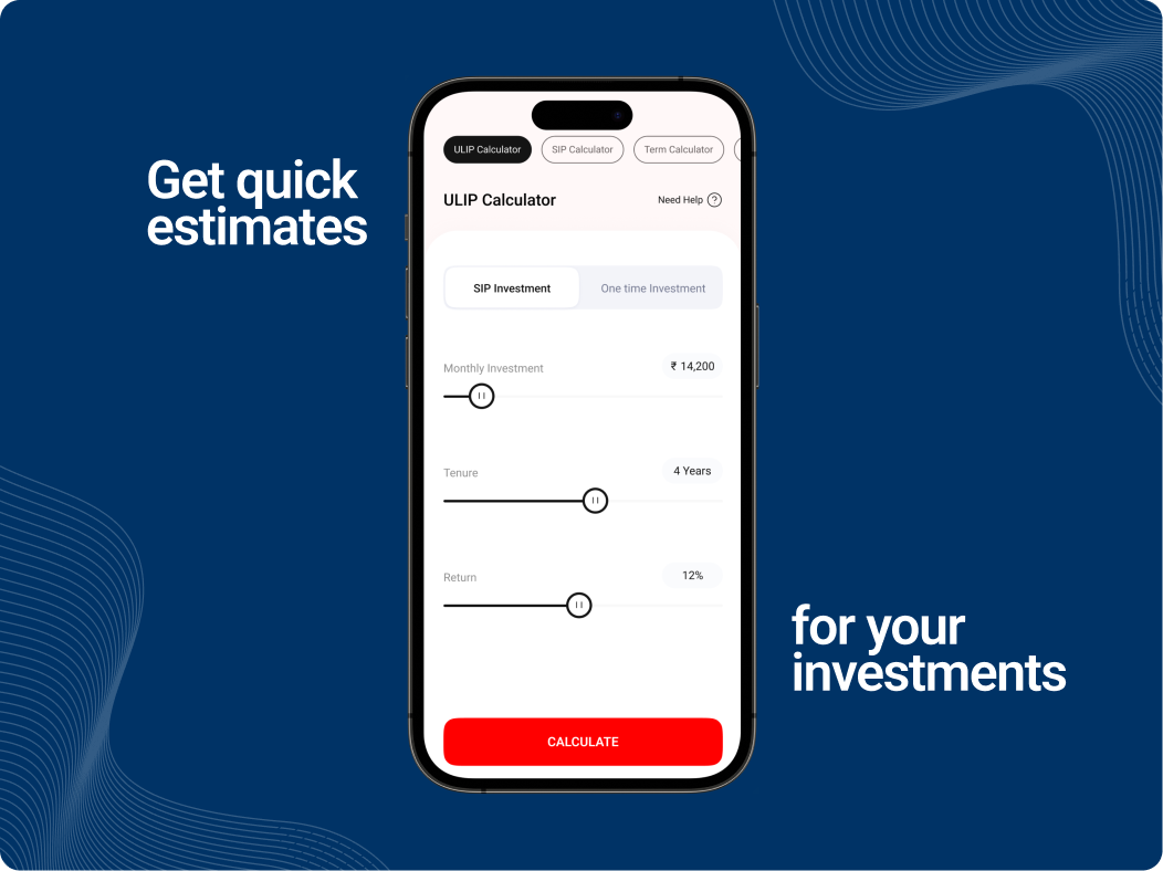
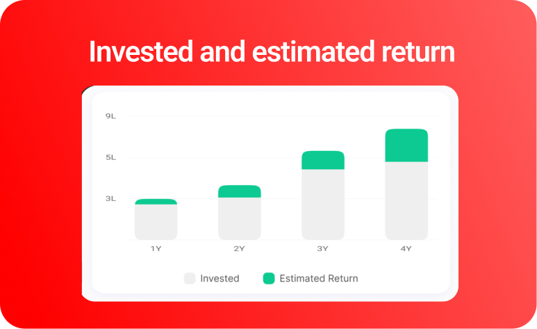
Insurance calculators were treated as an important part of the decision-making journey. The redesigned experience takes a mobile-first approach, making these tools more accessible and easier to use on smaller screens. Users can adjust inputs and understand estimated outcomes without dealing with unnecessarily complex interactions.
Bringing AI Into the Insurance Journey
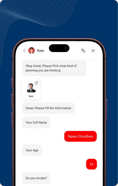
The experience also explores a conversational AI layer to help users find relevant information and products through natural interactions. Instead of requiring users to navigate through multiple categories, the assistant can understand their requirements and guide them towards relevant insurance options. The concept extends into personalised recommendations, where information provided by users can be used to suggest products aligned with their needs.
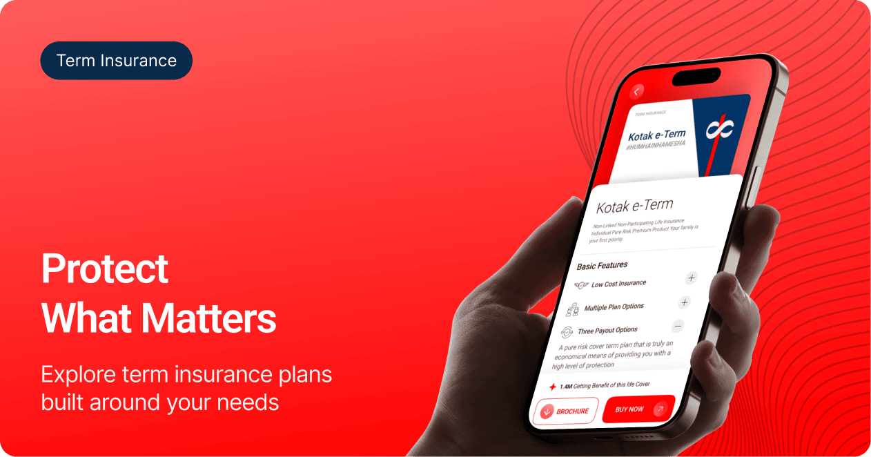
Mobile-First Insurance Experience
A mobile-first approach that simplifies complex insurance journeys, helping users discover the right products, explore benefits, compare options, and take action with ease.
Insights
Clarity drives confidence
Insurance can feel complex when users are faced with multiple products, benefits, and terms. Clear information and structured content help users understand their options and make decisions with greater confidence.
Personalisation makes discovery easier
Different customers come with different financial goals and life stages. Guiding users towards relevant products based on their needs can make product discovery more meaningful and reduce the effort required to find the right option.
Guidance simplifies decision-making
From exploring plans to comparing benefits and estimating returns, users make several decisions along the insurance journey. Clear guidance, calculators, and relevant information can make these decisions easier to navigate.
Frequently Asked Questions
1. What was the objective of the Kotak Life website redesign?
The objective was to simplify the insurance experience by making products, calculators, services, and customer journeys easier to discover and navigate.
2. How did the redesign improve product discovery?
We created clearer product categories and guided users based on their needs, helping them explore relevant insurance plans with greater ease.
3. How were insurance calculators improved?
The calculators were redesigned with simpler inputs and clearer outputs, making it easier for users to estimate coverage, investments, and potential returns.
4. How did you use AI in the Kotak Life experience?
We explored an AI-powered conversational assistant that could understand user needs, guide them through questions, and recommend relevant insurance products.
5. What role did customer personas play in the redesign?
We considered different needs across new and existing customers, from exploring insurance options and understanding benefits to managing policies, paying premiums, and filing claims.
6. How did the redesign support a mobile-first experience?
The experience was designed to make key insurance journeys, product discovery, calculators, and AI-assisted interactions accessible and easy to use on mobile devices.
Similar Projects
Designed for TATA AIG, CommissionR helps sales managers structure commission payouts for producers across different insurance segments of businesses.
Designed an insightful dashboard for RiskProfiler that enhances security with advanced cybersecurity solutions, providing real-time ratings and automated risk analysis.
A modern website redesign for Cosign, a Belgium-based global signage brand, focused on enhancing credibility, product discoverability, and serving diverse international markets.






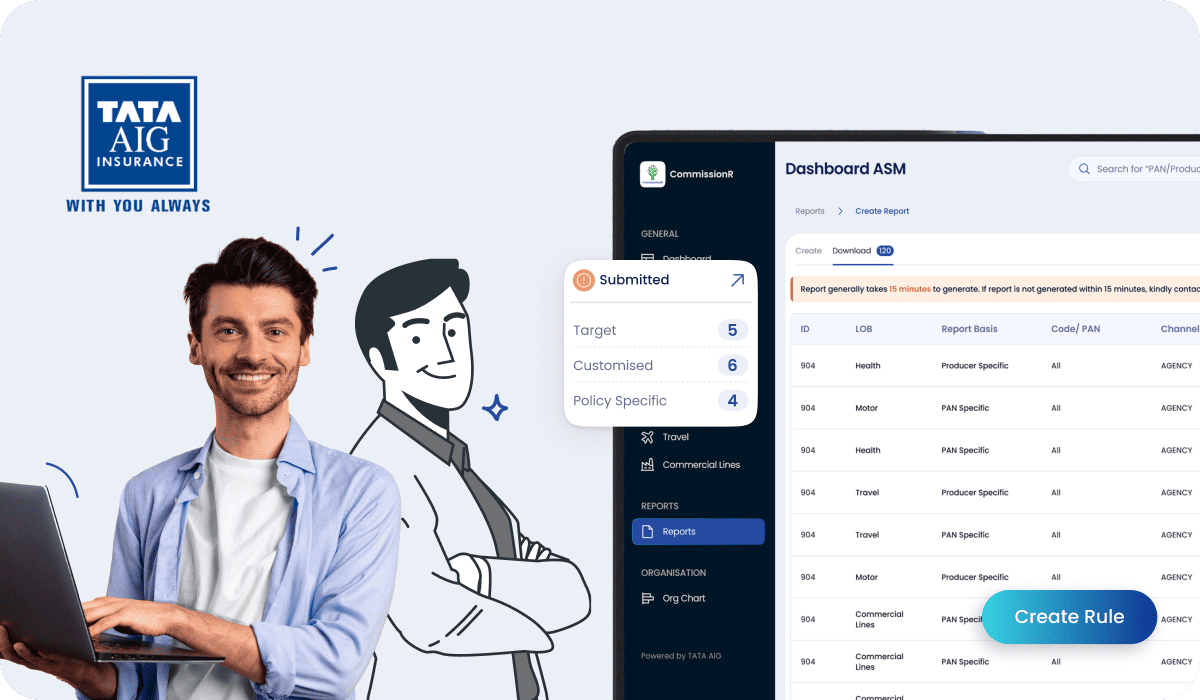 FintechTATA AIG
 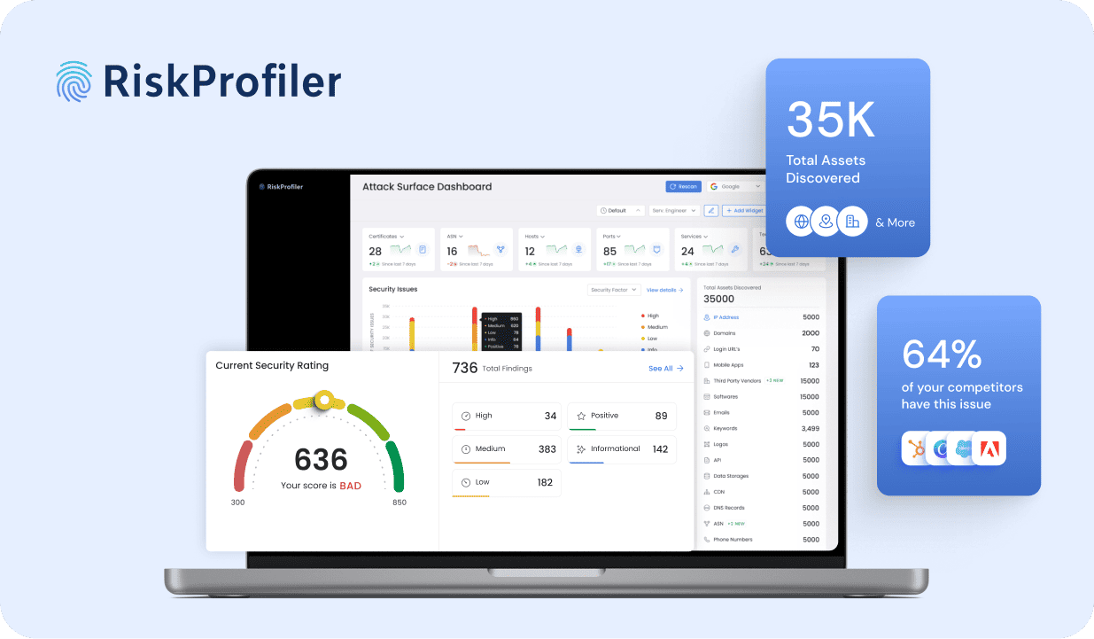 Cyber SecurityRisk Profiler
  Envision Displays
 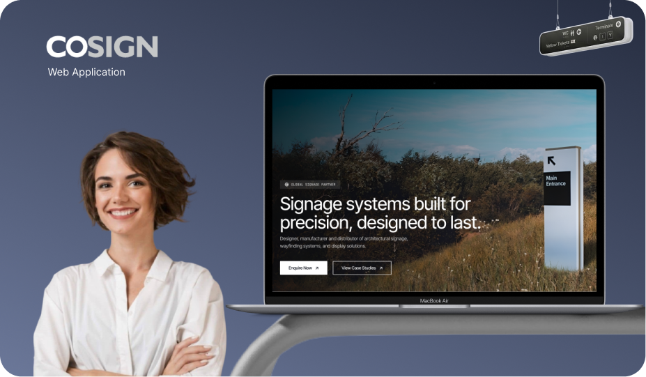 Sinages & DisplaysCosign