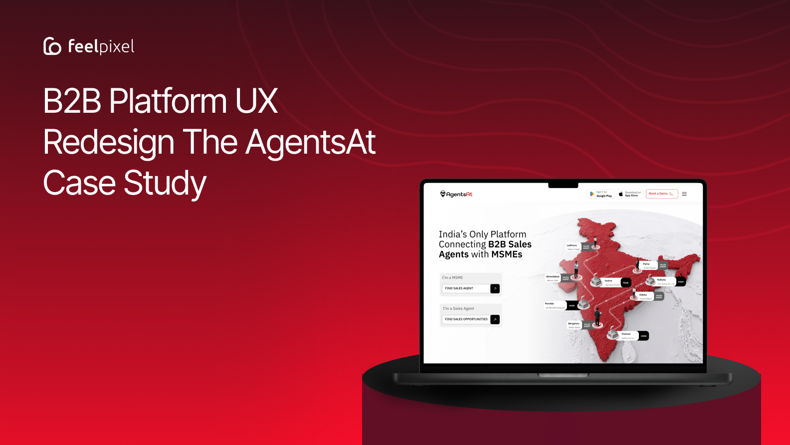
Explore how Feelpixel redesigned AgentsAt with clearer B2B positioning, dedicated user journeys for MSMEs and sales agents, and a cohesive digital experience.
Quick answer
A B2B platform UX redesign helps businesses connect with the right partners through clearer positioning, intuitive navigation, audience-specific user journeys, and trust-building design. For AgentsAt, Feelpixel focused on simplifying the platform’s two-sided business model, helping MSMEs discover sales agents while enabling sales professionals to explore relevant business opportunities.
The redesign created a more cohesive, accessible, and scalable digital experience designed to make these connections easier to understand and navigate.
Introduction
India’s MSMEs often need to expand into new markets but may struggle to build sales teams and find reliable sales partners. At the same time, independent sales agents need access to relevant business opportunities that match their industry expertise, location, and professional experience. A B2B platform can bridge this gap, but only when its B2B platform UX design makes the value clear and helps both audiences find what they need.
For a two-sided platform like AgentsAt, the challenge goes beyond visual design. The website must communicate two different user needs within one cohesive experience, establish trust, and guide each audience toward the right next step.
A strong user experience should help answer three essential questions:
- Can MSMEs easily understand how to find suitable sales agents?
- Can sales agents discover relevant business opportunities?
- Can both audiences trust the platform enough to take action?
What Is B2B Platform UX Design?
B2B platform UX design is the process of shaping how businesses and professionals discover partners, evaluate opportunities, and build working relationships through a digital platform. It goes beyond visual design to clarify the platform’s value, organize information, build trust, and guide different user groups toward their goals.
- User journey design: Creating distinct pathways for businesses seeking sales agents and agents looking for business opportunities.
- Information architecture: Organizing platform features, industry categories, profiles, and opportunities so users can find relevant information easily.
- Trust and conversion design: Communicating value clearly, reinforcing credibility, and helping users take the next step toward a potential business partnership.
Why B2B Platform UX Design Matters for Business Growth
As B2B businesses increasingly rely on digital platforms to discover suppliers, evaluate opportunities, and build partnerships, a website must do more than present information. It needs to make complex business relationships easier to understand, navigate, and trust.
These findings highlight an important UX opportunity.
B2B platforms need to combine clear information, intuitive self-service journeys, and credible trust signals. For AgentsAt, this meant helping MSMEs understand how to find suitable sales agents while enabling sales professionals to discover relevant business opportunities through one cohesive digital experience.
What are the Core Challenges for B2B platform UX Design
The redesign focused on three primary challenges:
- Clarifying the brand and value proposition
- Creating a consistent experience for two different user groups
- Communicating a complex platform through a simpler visual language
These challenges were closely connected. If users could not understand what AgentsAt did, they would not know which journey to take. If the two audiences were forced through the same experience, the platform would feel generic. And if the complexity of the ecosystem was communicated poorly, even a strong value proposition could become difficult to understand.
Our solution was to address each problem through a combination of information architecture, audience-specific experiences, trust communication, and visual design.
Challenge 1: A New Concept Struggled to Establish Its Value
As a relatively new concept, AgentsAt needed to quickly establish what it offered, who it was for, and why users should trust it. However, it lacked clear brand positioning, making the platform difficult to understand at first glance and limiting meaningful interest.
The platform sits between two traditional models. It is not a typical job portal where candidates apply for salaried roles, and it is not a conventional recruitment agency hiring employees for companies.
AgentsAt connects MSMEs with independent, commission-based sales professionals.
That distinction needed to become clear within the first few moments of the experience.
A new visitor needed answers to fundamental questions:
- What exactly is AgentsAt?
- Who can use it?
- How does it help MSMEs?
- What does a sales agent gain?
- How is it different from traditional hiring?
Our Solution: Establishing a Clear Platform Story
We restructured the homepage to introduce the core relationship behind AgentsAt before moving into deeper platform information.
The experience starts by communicating the larger problem: businesses need sales reach, while experienced sales professionals need relevant opportunities.
AgentsAt then becomes the connection between the two.
This helped reposition the website around a clearer value proposition rather than presenting the platform as a collection of disconnected features.
One Common Homepage, Two Clear Entry Points
Because both audiences belong to the same ecosystem, we designed the homepage as a common entry point.
Instead of immediately separating users into completely different websites, the homepage first establishes the overall AgentsAt story. Users can then identify the path most relevant to them through clear calls to action:
- I’m an MSME
- I’m a Sales Agent
This creates a simple transition from understanding the platform to exploring a more relevant journey.
The structure became:
Understand AgentsAt → Identify Your Role → Explore Your Dedicated Journey
This allows the platform to communicate one clear brand proposition while still supporting two different user needs.
Challenge 2: A Lack of Cohesion Weakened Trust
Inconsistent visual language, generic content, and unclear information hierarchy made the experience feel fragmented. For a new platform, this made it harder to establish the credibility and confidence needed to engage.
For a platform built around business relationships, the website itself needed to communicate professionalism and credibility from the first interaction.
Our Solution: Building a Unified Brand Experience
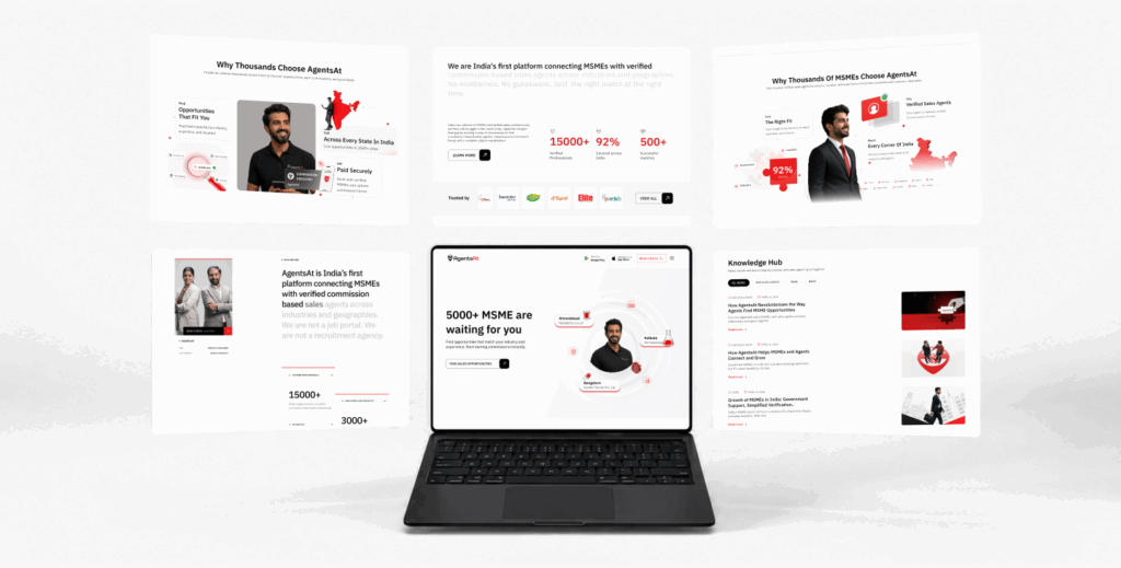
We created a consistent system across the website, bringing together typography, colours, content hierarchy, components, layouts, and interactions.
The content was also restructured around clearer messaging. Instead of generic information, key sections explain the platform’s value, audience, opportunities, industries, and network in a more organised sequence.
This gave AgentsAt one connected identity rather than making the website feel like a collection of separate pages.
Building Trust Into the Experience
Trust became an important part of the redesign because both audiences are evaluating potential business relationships.
An MSME needs confidence in the sales professionals it discovers. A sales agent needs confidence in the businesses and opportunities available on the platform.
We addressed this by making trust visible throughout the experience.
Showing Proof Through Numbers
Key platform figures were brought forward as social proof, including:
- 10,000+ B2B Sales Agents
- 5,000+ MSMEs
- 500+ Verified Connections
- 1,000+ Cities
These numbers help communicate the scale of the AgentsAt ecosystem and give new visitors visible evidence of the network behind the platform.
Making Verification Visible
We also highlighted verified agents and businesses across relevant parts of the experience.
Combined with platform statistics, testimonials, connections, and credibility messaging, these signals help users build confidence while exploring rather than relying on a single statement claiming that the platform is trusted.
Challenge 3: One Platform, Two Distinct User Needs
AgentsAt needed to communicate value to two distinct user groups: MSMEs looking for sales talent and agents looking for relevant opportunities while keeping both experiences connected under one platform.
This created an important UX challenge.
MSMEs and sales agents are connected by the same ecosystem, but their goals are different.
An MSME may arrive asking:
- How can I find sales professionals?
- Can I expand into new markets?
- Can I find agents relevant to my industry?
- Are the professionals on the platform trustworthy?
A sales agent may instead want to know:
- What opportunities are available?
- Which businesses are looking for sales professionals?
- Can I find opportunities relevant to my experience?
- How can I start earning commissions?
A single generic journey would not answer these questions effectively.
Our Solution: Dedicated Journeys for Each Audience
We created audience-specific pages and content paths while maintaining the common AgentsAt brand and visual system.
The MSME experience focuses on:
- Finding sales agents
- Discovering industry-relevant professionals
- Expanding market reach
- Building sales partnerships
- Connecting with verified professionals
The Sales Agent experience focuses on:
- Finding relevant opportunities
- Exploring businesses
- Discovering opportunities by industry and location
- Understanding commission-based work
- Starting their journey with AgentsAt
This allowed us to provide more relevant information to each group without splitting the platform into disconnected experiences.
Keeping Both Journeys Connected
Although the content changes based on the user, the design system remains consistent.
Both journeys use the same:
- Brand language
- Visual identity
- Typography
- Components
- Interaction patterns
- Trust signals
The result is a simple model:
One Brand → One Shared Platform → Two Distinct User Journeys
The Visual Direction
The visual redesign was built around the idea that AgentsAt is more than a corporate service website.
It is a platform built around connections. Connections between businesses and agents. Between industries and opportunities. Between local expertise and nationwide growth.
The visual language needed to communicate this idea while making the platform feel credible, modern, and approachable.
Imagery and 3D Glass Illustrations
We introduced custom 3D glass illustrations to represent different parts of the ecosystem.
These visuals help communicate ideas such as:
- Connecting businesses and professionals
- Sales growth
- New opportunities
- Industries and markets
- Business expansion
- Nationwide reach
The glass treatment created a recognisable visual style that could be used consistently across pages and content types.
Iconography and Colour
Glass-style iconography added another layer to the design system, helping users quickly scan benefits and platform features.
The bold red colour creates emphasis around key moments and calls to action, while black and neutral tones provide contrast and structure.
This balance helped create an experience that feels energetic without becoming visually overwhelming.
Interactions and Animations
Motion was used to make the experience feel more active and responsive.
Subtle animations, transitions, hover effects, and interactive states help guide users through the content and provide feedback as they explore.
The role of animation was always connected to the experience:
- Highlight important information
- Guide visual attention
- Support content discovery
- Make interactions feel responsive
This created a more dynamic website while maintaining the clarity needed for a B2B platform.
This created a more dynamic website while maintaining the clarity needed for a B2B platform.
The Impact
By combining clearer positioning, audience-specific journeys, visible trust signals, and a cohesive visual system, the website now makes it easier for users to understand the platform, identify where they fit, and move toward the right opportunity.
A Stronger Platform Presence
AgentsAt now presents itself as a distinct B2B sales ecosystem rather than simply another hiring or job platform. The redesigned experience communicates its role in connecting businesses and sales professionals with greater clarity and consistency.
Better Alignment Between Users and Business Goals
The two audience journeys create a clearer path from intent to action. MSMEs can focus on finding sales talent and expanding their market reach, while sales agents can focus on discovering relevant opportunities and building new partnerships.
Trust That Is Visible, Not Just Claimed
Platform numbers, verification, connections, testimonials, and social proof give users tangible signals of the ecosystem’s scale and credibility. This makes trust part of the experience rather than a separate marketing message.
A Scalable Digital Foundation
The unified design system, responsive layouts, reusable components, and structured content architecture provide AgentsAt with a stronger foundation for adding new industries, locations, opportunities, and platform content as the business continues to grow.
The outcome: a clearer, more credible, and scalable digital experience designed to help MSMEs find the right sales partners and sales professionals find the right opportunities.
Client Perspective
— Vineeta Chaudhary, CEO, AgentsAt
Key Strategic Takeaways
The AgentsAt redesign demonstrates why B2B platform UX design must go beyond visual improvements. A successful platform experience needs to communicate its value clearly, support different user needs, and build confidence throughout the user journey.
For platforms connecting businesses with professionals, the key considerations include:
- Clear positioning: Explain what the platform does, who it serves, and how it creates value.
- Audience-specific journeys: Give each user group a clear path based on its goals, needs, and expectations.
- Trust-centered design: Use credible information, clear messaging, and relevant trust signals to help users make informed decisions.
- Consistent visual systems: Create a cohesive design language that supports usability, brand recognition, and future growth.
- Scalable UX architecture: Structure navigation, content, and components to accommodate new features, industries, and user requirements.
The key is to design a platform around what each audience needs to achieve, how easily they can achieve it, and how confidently they can take the next step.
Final Thoughts
B2B platform UX isn’t just about making a website look modern. It’s about making complex business relationships easier to understand and giving different audiences the confidence to take the next step. When MSMEs are looking for sales professionals and sales agents are looking for relevant opportunities, every unclear message, generic journey, or missing trust signal can create friction at exactly the moment users need clarity.
The AgentsAt redesign demonstrates the value of treating a two-sided platform as its own UX challenge rather than applying generic website patterns. The experience needed to connect two distinct audiences while keeping them within one shared ecosystem. That meant clarifying the platform’s proposition, creating dedicated journeys, making trust more visible, and building a visual system around connection and growth.
Before designing or redesigning a similar B2B platform, come back to three fundamental questions: Can users quickly understand the platform? Can they find the journey relevant to their goals? Can they confidently take the next step? If the experience consistently answers those questions,the design goes beyond visual appeal and helps the platform deliver a better experience for its users while supporting business goals.
Frequently Asked Questions
What makes UX design for a two-sided B2B platform different from a regular website?
A two-sided B2B platform serves different user groups with different goals. The experience needs to provide relevant journeys for each audience while maintaining one clear brand and ecosystem. Businesses and service providers may need different information, but both still need to understand how their participation creates value.
How do you communicate a complex B2B platform clearly?
Start with the core relationship the platform creates. Instead of explaining every feature immediately, introduce the problem, the audiences involved, the value of the connection, and the next step. Information can then be progressively introduced as users explore further.
Why is trust important in a platform connecting businesses and sales professionals?
Users are considering real business relationships. Businesses need confidence in the people they connect with, while sales professionals need confidence that opportunities are genuine and relevant. Clear communication, verification, transparency, and a consistent digital experience all contribute to trust.
How do you design one website for MSMEs and sales professionals?
The best approach is to create audience-specific entry points and messaging while keeping the broader experience unified. Each audience should quickly find content relevant to its goals without making the website feel like separate products.
Why is information architecture important for B2B marketplace design?
Complex platforms often contain large amounts of information, including categories, industries, locations, opportunities, and resources. Strong information architecture helps users understand where to begin, what is relevant to them, and how to continue without feeling overwhelmed.
What should a B2B platform website prioritise during a redesign?
A strong redesign should prioritise clear positioning, audience understanding, information hierarchy, trust, discoverability, responsive usability, and a visual system that reflects the credibility and scale of the business.
About the Author
Written by the Feelpixel Team, a team of UI/UX and digital product design professionals focused on creating intuitive, user-centered digital experiences. Their expertise spans product strategy, UX design, and scalable digital solutions across SaaS, cybersecurity, healthcare, EdTech, and complex B2B platforms.
Looking to Build a Better B2B Digital Platform?
Redesigning a B2B platform takes more than a visual refresh. It requires a clear product strategy, intuitive user journeys, and trust-centered design that helps different audiences understand the value of your platform and take the right next step.
Planning to improve your platform’s user experience?