Air India Express is a value-focused airline, part of the Tata Group, operating over 500 flights a day across domestic and international routes. Its digital experience needs to make flight discovery, comparison, booking, and travel add-ons feel simple and engaging. We explored a conceptual design as part of our response to an Air India Express request for proposal (RFP), that brings greater clarity to the booking journey while creating a more engaging and distinctly Air India Express visual experience.
UX Strategy
Website Design
UI Design
Responsive Design
Visual Design
What Challenges Did Air India Express's Website Face?
01
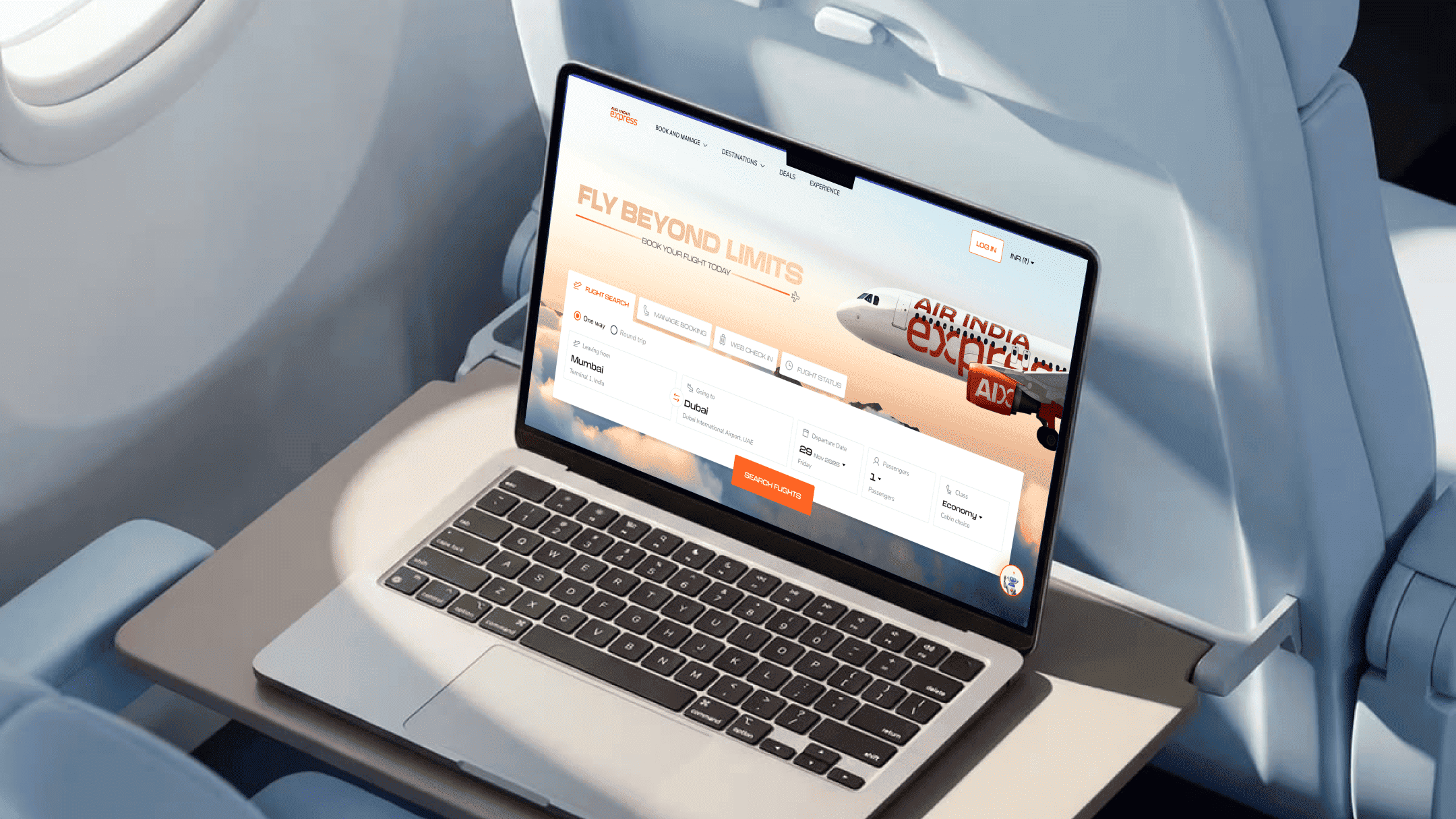
A Busy First Fold Made Flight Search Less Prominent
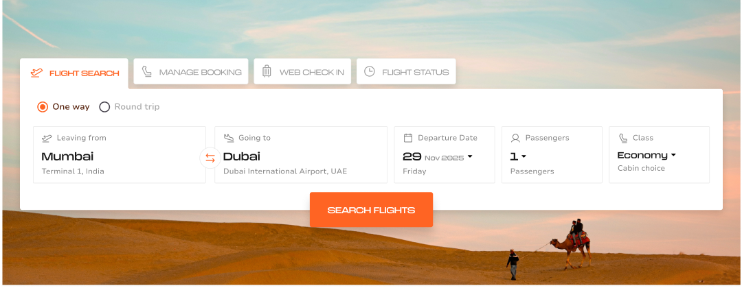
The existing landing page presented multiple elements competing for attention, making the primary flight-booking action less prominent. The experience needed a clearer hierarchy that would help users begin their journey quickly.
02
Limited Decision Support Made Flight Comparison Difficult
The existing flight-selection experience did not provide enough contextual information to help users compare options confidently. Fare differences across dates were not immediately visible, while pricing details could require additional interaction.
03
Multiple Booking Steps Created Friction
Passenger information and ancillary-service screens created additional cognitive load. Users needed stronger visibility of their current position in the journey, along with persistent access to important flight information.
What Was the Objective of the Air India Express Redesign?
Understanding What Customers Need
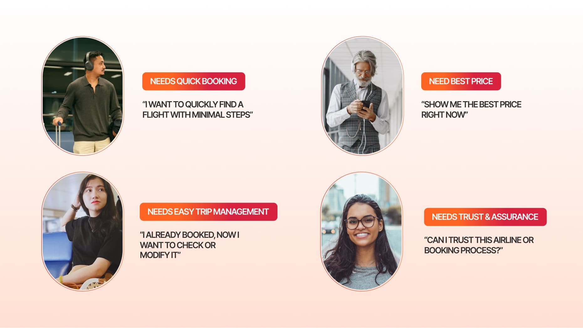
We explored the needs of different user personas across the booking journey, from travellers looking for a quick and hassle-free way to discover flights to price-conscious users comparing fares and options. We also considered passengers managing existing bookings who need easy access to their trip details, as well as users who require greater trust and assurance before completing a booking. These varied needs became the foundation for creating a faster, more transparent, and more guided booking experience.
One Connected Ancillary Experience
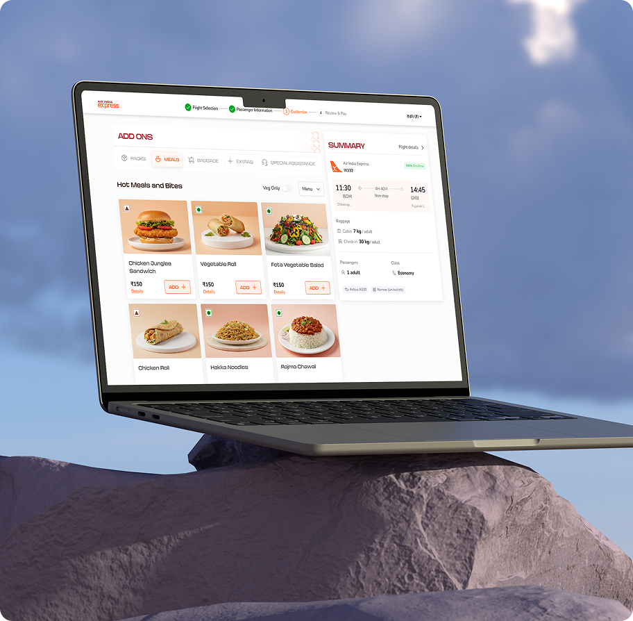
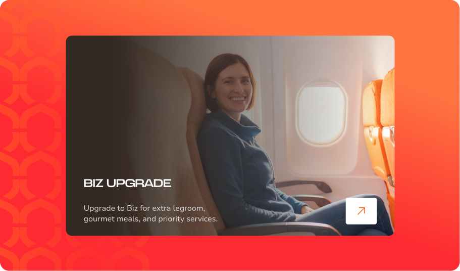
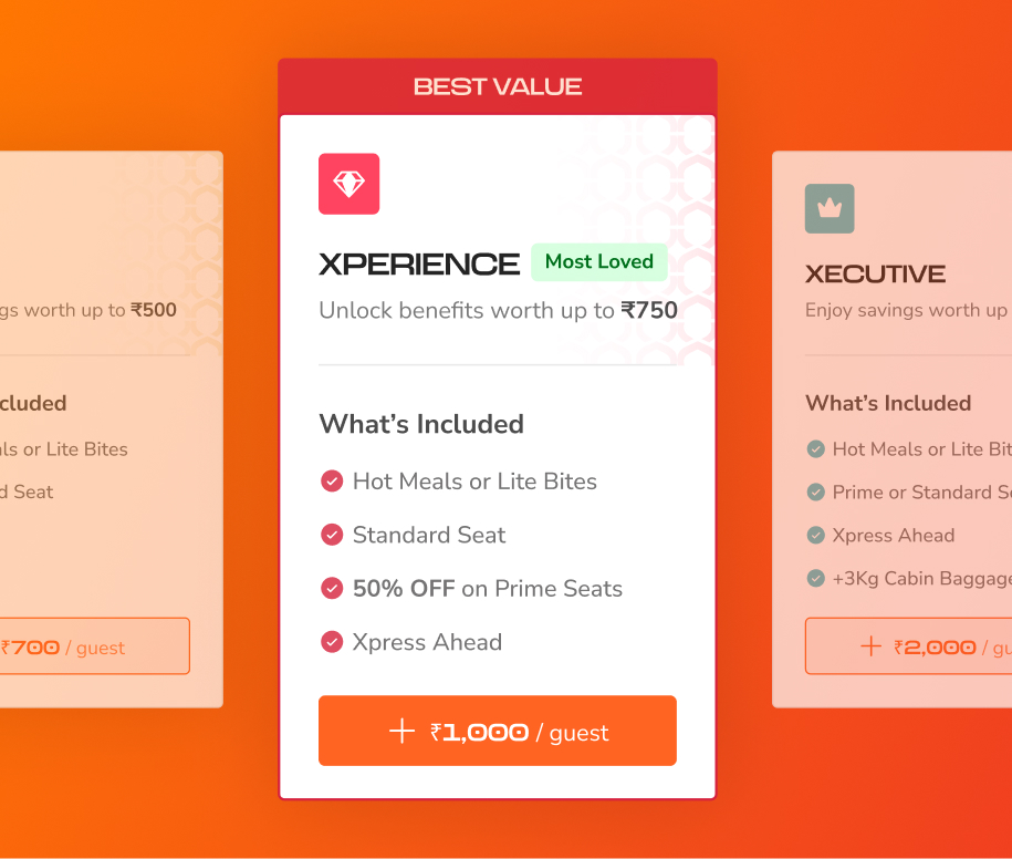
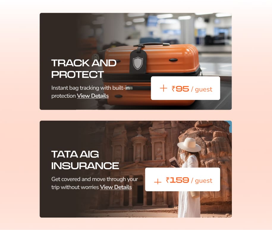
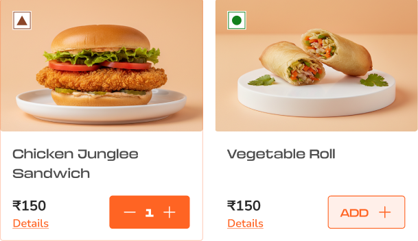
Baggage, meals, extras, and special assistance are brought together into a more structured experience, allowing users to manage additional travel requirements within the booking journey rather than navigating through disconnected choices. Users can select additional baggage based on their travel needs, choose meal preferences, and explore relevant services and assistance options without disrupting the booking flow. Packages are also structured around clear value propositions, helping users understand what is included before deciding to upgrade.
Making Flight Selection More Transparent
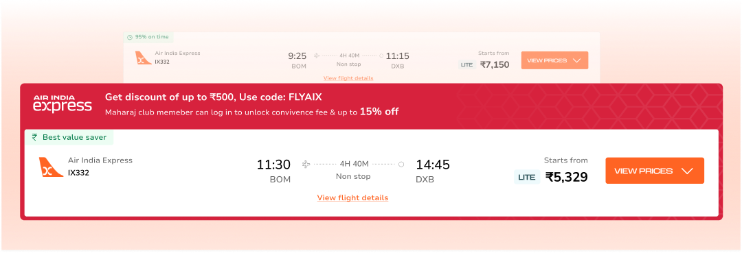
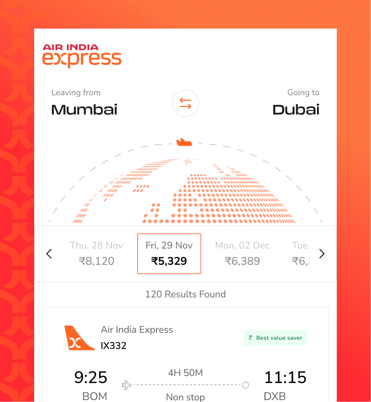
The flight-selection experience was redesigned to make fare comparison easier and reduce the effort required to understand pricing. A horizontal date selector allows users to compare fares across different travel dates and identify better-value options, while flight cards present key information in a clear hierarchy for easier scanning.
Offers, promo codes, and benefits are surfaced directly within the cards, helping users understand potential savings while comparing options. Inline filters allow users to refine flight choices without interrupting the browsing experience, while decision-support tags such as Best Value, On-Time Score, and Priority Check-in highlight important benefits at the point of decision.
Design Language
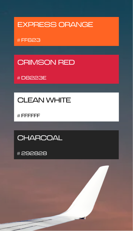
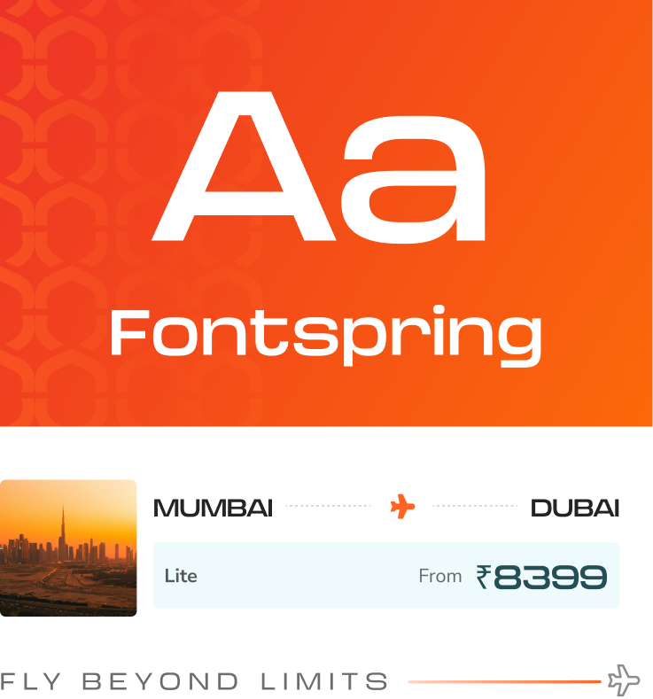
The design language builds on the existing Air India Express brand DNA without changing its core identity. It creates a warmer, more welcoming experience while reflecting the brand as a young, accessible, distinctly Indian, and value-oriented airline with a more expressive and personalised digital presence.
Reimagining Xpress AI
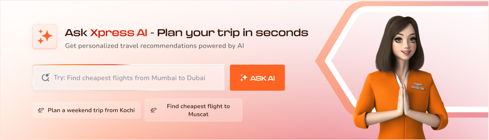
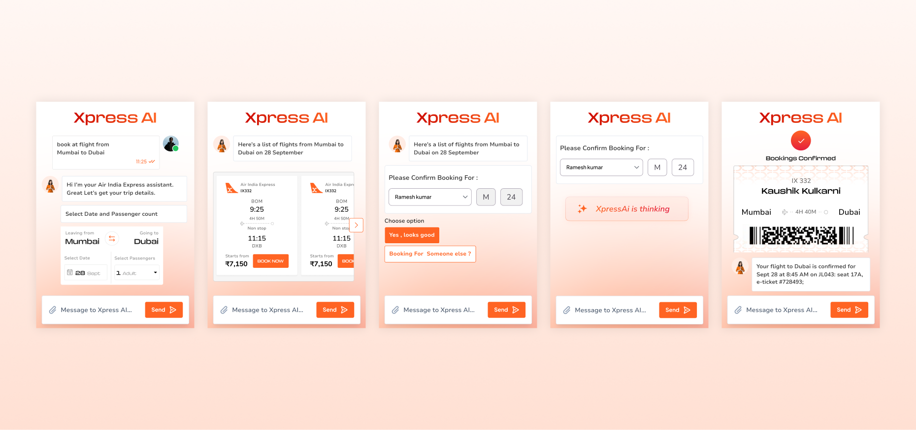
Xpress AI explores a conversational approach to flight booking, allowing users to communicate their travel needs naturally and receive guided assistance throughout the journey. This creates a more direct, engaging, and personalised booking experience.
Insights
Value needs to be visible
For value-conscious travellers, even small price differences can influence a booking decision. Making fares, savings, benefits, and add-ons visible at the point of choice helps users understand what they are getting for their money.
Guidance builds confidence
From flight search to passenger details and add-ons, users make several decisions before completing a booking. Clear progress, relevant information, and decision-support cues help reduce uncertainty and keep the journey connected.
Conversation can simplify booking
As users become more familiar with conversational AI, there is an opportunity to move beyond traditional step-by-step booking. Xpress AI explores how users can communicate their travel needs naturally and receive guided assistance from search through confirmation.
Frequently Asked Questions
1. What was the primary focus of the Air India Express website redesign?
The redesign focused on simplifying the flight-booking journey, improving information hierarchy, supporting easier fare comparison, and creating a more connected experience from flight search through passenger details and ancillary services.
2. How was the flight-search experience improved?
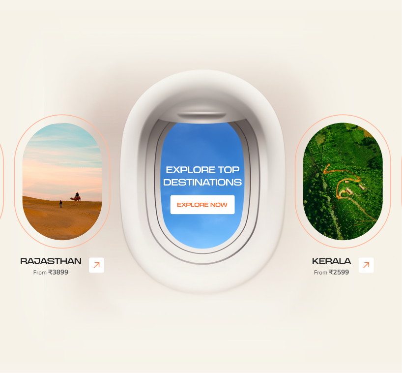
The flight-search experience was given greater prominence, with simplified inputs and smarter defaults to help users begin their journey with less effort. Deals, offers, and relevant fare information were also integrated without taking focus away from the primary booking action.
3. How does the redesigned experience help users compare flights?
Users can compare fares across different travel dates through a horizontal date selector, while structured flight cards, inline filters, and decision-support tags make important information easier to scan and understand.
4. How were passenger details made easier to manage?
Passenger information is organised into clear sections, supported by a progress stepper and a sticky flight summary. This helps users keep track of their journey while entering details such as passenger information, passport details, contact information, GST, and billing.
5. How does the redesign improve the ancillary-services experience?
Baggage, meals, extras, and special assistance are brought into a more connected flow. Clearer packages and value propositions help users understand available options before making an upgrade decision.
6. What design principles guided the experience?
The experience was shaped around putting users first, creating a predictable and guided journey, surfacing relevant information at the right moment, balancing business and user needs, and introducing stronger visual and emotional engagement.
Similar Projects
Repositioned the brand as a modern, conversion-focused and globally credible platform tailored for both Australian and international buyers.
A modern website redesign for Cosign, a Belgium-based global signage brand, focused on enhancing credibility, product discoverability, and serving diverse international markets.
Designed an insightful dashboard for RiskProfiler that enhances security with advanced cybersecurity solutions, providing real-time ratings and automated risk analysis.




 Envision Displays
  Sinages & DisplaysCosign
  FintechTATA AIG
  Cyber SecurityRisk Profiler