Pyxel Art website design was the challenge Feelpixel took on for this line of E-paper art frames designed to redefine how curated visuals are experienced in premium interior spaces. It is a product by Cosign, a signage design and manufacturing systems company with a growing portfolio of experiential display products.
Website Design
M-site
B2B
Product Catalogue
Why Was Product Storytelling Critical for the Pyxel Art Website Design?
01
Explaining something people haven't seen before
Most visitors landing on this page wouldn’t know what E Ink is. We needed them to get it quickly and more importantly, want it without turning the page into a tech manual.
02
Showing a physical product through a screen
The whole appeal of Pyxel Art is how it feels in a room the paper-like surface, the way it responds to natural light, the fact that it doesn’t glow at you from the wall.
03
Showing "how does it actually work?"
A premium buyer is going to have practical questions and the page needed to answer all of that without making the whole thing feel like a spec sheet.
How Feelpixel Turned Product Storytelling Into an Immersive Pyxel Art Website Design
The page needed to make someone fall in love with the product, understand it, trust it, and reach out. So the structure was thought through carefully. You start with an emotional hook, move into what the product actually is, see it living in a real home, understand what makes it different, learn how easy it is to use, see it in different spaces with different artwork, get your questions answered, and then find a friendly contact form waiting at the bottom.
Controlling the experience without taking control away
Premium digital experiences often lean into guided, cinematic scrolling but there’s a fine line between feeling curated and feeling trapped. The challenge was designing scroll-driven interactions and auto-scrolling sequences that felt intentional and elegant, while still giving users the freedom to move at their own pace and revisit sections naturally.
Bringing the real world into the browser
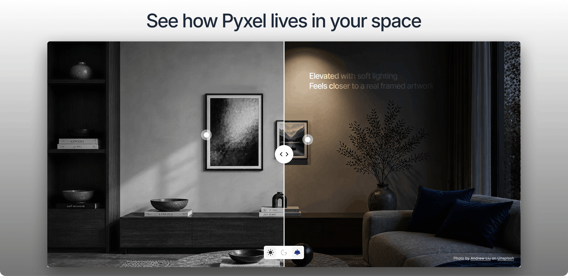
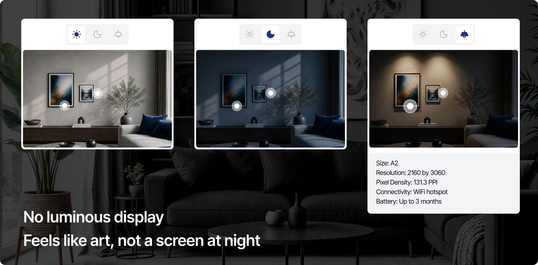
One of the most distinctive sections of the page shows the Pyxel frame as it actually looks across three real lighting conditions natural daylight, a dark room, and a conventionally illuminated interior. The challenge was making the webpage itself reflect that shift. As the user scrolls through each mode, the page environment needed to respond light, dark, and in-between, so that the browsing experience mirrors what it would genuinely feel like to live with the frame. The goal was to blur the line between seeing the product and experiencing it.
Making a premium product feel premium on screen
The frame is a luxury object but a webpage, by default, is just a page. The design had to work hard to close that gap. Every decision around spacing, typography, animation, and pacing had to signal quality before the visitor had read a single word.
Insights
Controlling the experience
Auto-scroll that pauses on hover, sequences that can be manually advanced, these small affordances make the difference between a presentation and a conversation.
Context creates
desire
When the page itself shifts from bright to dark alongside the product photography, the visitor stops evaluating and starts imagining. That shift from assessment to desire is exactly where a purchase decision begins.
Motion has a
direction
Not all movement is equal. Motion that reveals content sliding up into place, a section fading in as you arrive feels generous. Every animated moment on this page was designed to move in one direction: toward the product, not away from it.
Hear it from our client
We had a product that was difficult to explain digitally, but the Feelpixel team understood the brief really well and helped simplify the experience for users. They created a premium brand identity and landing page that felt clean, thoughtful, and aligned with our vision. The lighting modes section especially stood out, as it reflected the product behaviour in a very realistic and intuitive way. The team was collaborative throughout the process, and the final outcome captured the product beautifully.
Tejasa PurandareExecutive Director, cosign india
Frequently Asked Questions
1. What was the main challenge in explaining a brand new category with a single landing page?
The challenge was to simplify a complex product and communicate its features clearly through a digital experience. A key focus was realistically showcasing the different lighting modes, helping users intuitively understand how the product behaves in real life.
2. How did Feelpixel make an e-ink product feel premium on screen?
Pyxel Art was a product that was difficult to explain digitally, but Feelpixel understood the brief and focused on simplifying the experience for users. The team built a premium brand identity and landing page that felt clean, thoughtful, and aligned with Cosign’s vision, letting the design carry the sense of quality even before visitors understood the product itself.
3. How Feelpixel structured the landing page to represent this product ?
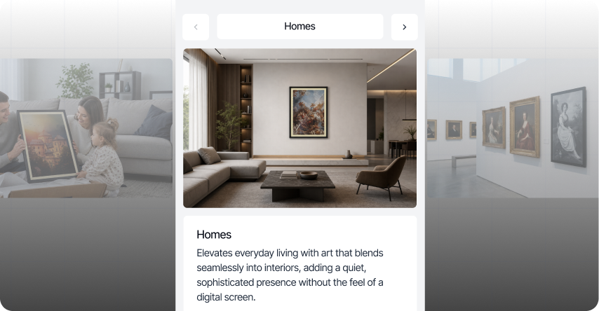
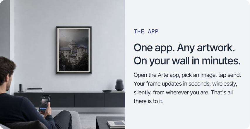
The page follows a clear sequence: an emotional opening, an explanation of what the product actually is, a look at it living in a real home, a breakdown of what makes it different, a walkthrough of how easy it is to use, examples across different spaces and artwork, and finally a contact form. Each section leads naturally into the next.
4. How does the website show Pyxel Art working in real lighting conditions?
One section displays the frame as it actually looks across three real lighting conditions: natural daylight, a dark room, and a conventionally lit interior. As users scroll through each mode, the page itself shifts brighter or darker to match, so browsing the site feels closer to living with the frame than just viewing photos of it.
5. How did Feelpixel balance guided storytelling with user control on the Pyxel Art site?
Premium digital experiences often lean on cinematic, auto-scrolling sections, but there is a fine line between feeling curated and feeling stuck. Feelpixel built scroll-driven sequences that pause on hover and can be manually advanced, so the page feels intentional while still letting people move at their own pace.
Similar Projects
Repositioned the brand as a modern, conversion-focused and globally credible platform tailored for both Australian and international buyers.
A modern website redesign for Cosign, a Belgium-based global signage brand, focused on enhancing credibility, product discoverability, and serving diverse international markets.
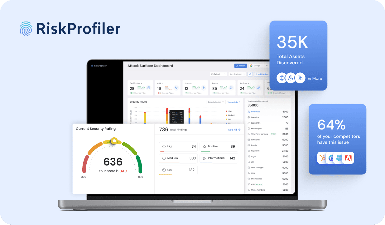
Designed an insightful dashboard for RiskProfiler that enhances security with advanced cybersecurity solutions, providing real-time ratings and automated risk analysis.



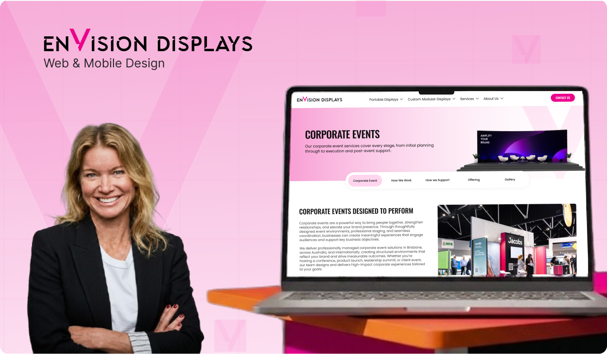 Envision Displays
 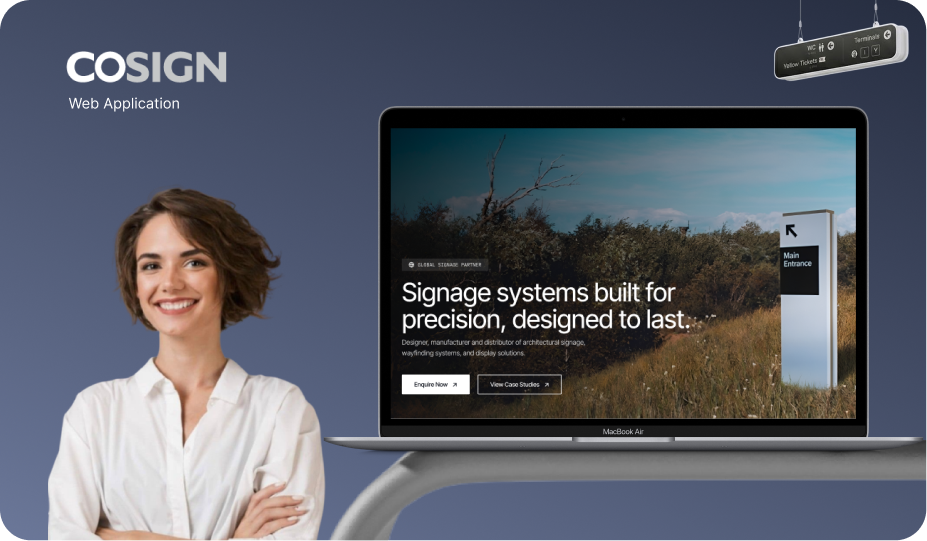 Sinages & DisplaysCosign
 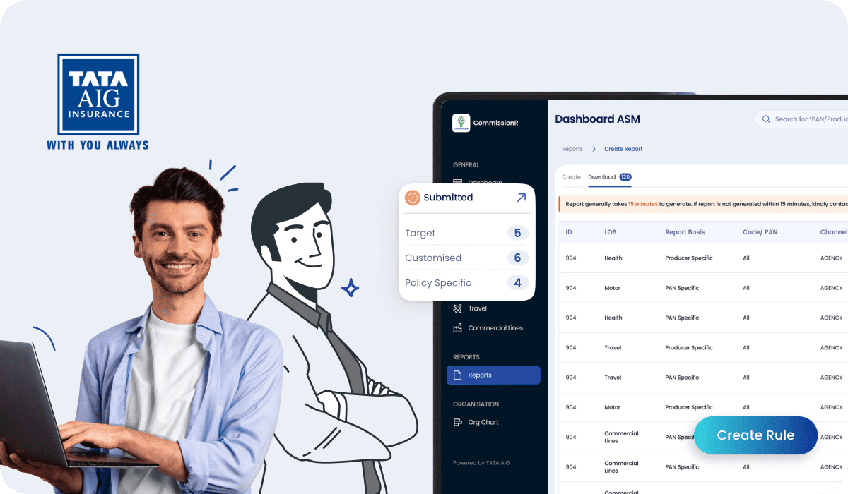 FintechTATA AIG
  Cyber SecurityRisk Profiler